Daily UI 16 – Popup Message

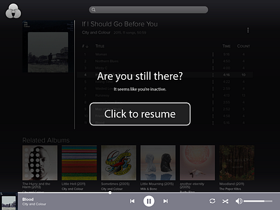
Modals are annoying, I think everyone can agree to that. This design is reuses my previous music player design. The bottom controls are still visible, so that users can still access it without having to go through the modal message. The message is also direct, and has one single call to action: a huge button. Not a small x, not a small hyperlink, but a huge fat button. It's so easy to hit you don't even need to hit the button, but clicking anywhere on the screen will hide the message. This is probably a pretty niche and specific use case for a modal, but keeping it simple and direct is key.