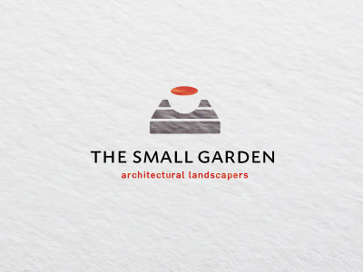
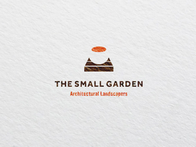
The Small Garden Logo
Tweaked a number of elements based on some earlier feedback.
Two new fonts with reduced tracking all round.
Slightly wider and shallower decking/surface structure whilst making the urn/pot smaller as well.
Also reduced overall perspective of the mark just a fraction.
I feel this helps define the urn a little better than before without having to resort to adding further elements,
View all tags
Posted on
Aug 10, 2011
More by Smithographic – Logo Designer & Digital Design Studio. View profile
Like


