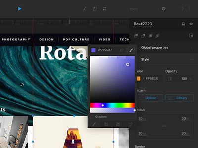
Search UI


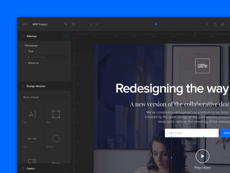


Hi! This is the latest search concept we are exploring at UXPin new editor.
We introduce here a sort of pattern which can improve UX of search.
Similar solution use Google Maps, Facebook or music apps.
Description: after clicking on search icon user is able to see recently used items before typing anything. When user is typing something particular for example "box" new suggestions appears as quick as possible. In that moment recently used elements lower their visibility and become less prominent. Current example is based on focus state so that's why animation switch between the elements showing blue border. In case when user will click on item it will appears on canvas. However we are not showing it here for a purpose of producing an animated loop. So animation starts and ends in the same place. PS. You can see hover version inside the attachements. I was responsible for introducing recent items into search, icons, baseline and transitions.
HD view: https://vimeo.com/167439011
Credits (team work):
Lead Designer: Sebastian Witman vel keithar
Landing Page design on canvas: Michael Korwin
UX architecture: M. Treder, K. Zięba, B. Dębicki, R. Taraszka