Paws Up progress

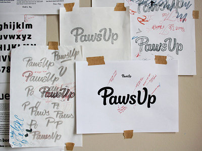


I'm currently working on a logotype for Paws Up, a new pet accessory and outfitter brand. The goods are all individually hand made using recycled materials, so we were looking for some lettering with a natural, hand drawn feel but that isn't too heavily scripted. The direction we've gone in uses custom brush style letters that have a certain degree of scripty-ness (the swashes, stroked terminals, joined 'a-w', general curvature throughout, etc.) but maintain a generally spacious and very legible approach, as the logo needs to work at very small sizes.
Initially roughly drawn with a Tombow brush pen, I drew over the outlines with a pen (page on the left) and then edited it digitally (the print out on the top right). From the final sketch (top middle), we talked about changes most notably to the 'U' and 's', but I also changed the 'a' quite heavily as well as various other adjustments (current vector version attached).
There are a couple of things I'm still thinking about, mainly the spacing. We've been talking about the 'U-p' and how to make sure the 'p' doesn't feel isolated while also matching the 'P-a'. I'm also not entirely sure about the size/rotation of the 's' compared to the rest. Any thoughts on either point?