


New TBS Logo

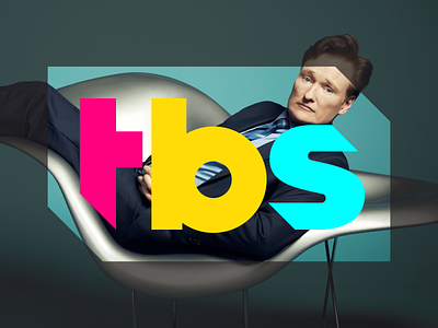

Hello, all. Been pretty busy and haven't posted for a while. I've had to keep this one under wraps for some time and now I can finally share it. Over the summer I designed a new logo for the cable TV network, TBS. TBS aired the new logo along with a new brand this past weekend. Earlier this year TBS began creating a new brand to coincide with it's shift in format toward producing more original comedies, late-night talk shows and animated series with “big unscripted ideas with attitude.” They want to shift toward a slightly younger, slightly male demographic and be perceived as diverse, bold and on the cutting edge of pop culture. I was approached to help create a new logo for TBS that would work with the new brand. They also wanted a logo that could be more chameleon-like, not changing in shape, but able to be reskinned, recolorized, and contain imagery or patterns. There are two versions of the logo, one with and one without the cut-corner containment. TBS asked that the letterforms be constructed in a more non-traditional manner to match their brand, so the slight oddity and quirkiness in the forms are intentional. TBS has produced a number of :10 second video bumper reels that are airing now one per day which are fun, quirky, humorous, weird and edgy. They have also created some nifty animations with the logo as well. You can see the work I did for them in the attachment which includes some brand imagery created by TBS. Be sure to check out a page on my new website that also contains two videos which really bring the logo to life: http://www.seanheisler.com/portfolio/tbs