Frank's Logotype


Hi guys,
I've been doing hand-lettering for over 2 years so far, luckily I have more time to do it in deeper level now.
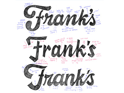
This is a process from one logotype I've been working on, it's "Frank's Bakehouse" - the client want something with script, bold, and also have a classic modern twist. Which one you love the most? 1? 2? 3?
--------------------------------------------------
I am redoing my website, will make it more like a blog soon, so I can write some updates, process and interesting tutorial.
Email list (join over 300+ other cool dudes)
Instagram - I update some lettering stuff here if you're interested