


Bold portfolio intro

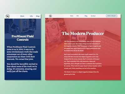
I'm dissatisfied with the way an intro to a project is displayed on my website and beginning to experiment with a different design to them based on gradients (which Sketch didn't preserve on export for some reason), and background images. The background images have a gradient overtop of them, and then there's another gradient overtop of that featuring the brand colour for the project.
The text overtop is a quick intro, and beneath it the article would continue with a more muted colour scheme.
I want this to be attention-grabbing and optimized for mobile, where I feel my current design needs some improvement.
The design elements here are mobile on the left and desktop on the right, but I feel that there's some obvious limitations to what I'm trying to do. For example, the text shouldn't be longer than a couple paragraphs. All a learning process, right?
Would love some feedback on this one. Anything here sound like an awful/amazing idea?