lowatt Diplom work

I kinda love simple design. Simple means to me even more work and reflection as everything has to be perfect.
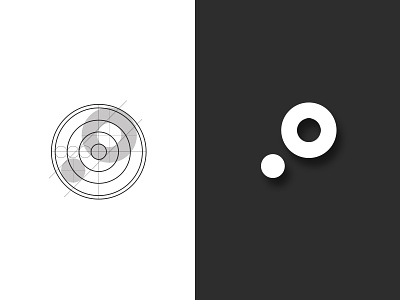
The idea behind this logo is this :
the bigger circle represent a area, a specific space. This space can "live" by itself. The smaller one represent the brand Lowatt (a external lighting company).
The fact that they pass exactly together shows that the products the company offers are perfectly selected for an
specific area. Those products fit in harmony in.