Google New Logo - Exploration

This is just a design exploration based on the new Google Logo. It is no way related to the Google branding guidelines/rules nor associated with Google in any way. The team behind the work might have spent hundreds of hours and iterations to come up with the final one, but this is in no way a suggestion or altercation to their final work.
--
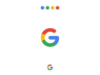
Google has just announced the new logo that paints a new look of freshness. With more reasons/elements behind the logo and its purposes. While going through the documentation (which can be found here: https://goo.gl/3kmxw6) I got curious about the dots animating to create the compact version of the logo with just the letter 'G' but with the edges cut in the last frame or abruptly (?) or to match the sans-serif typeface (Product Sans) The font is slick and the logo being more rounded reminded some very recent brand refresh of some other tech giants; anyway, that is a different story - lets not go there.
So I wanted to try out and see how the letter 'G' might have looked if the animating circles were not constrained inside the grid of the sans-serif font. This is what I got after spending a few mins with Illustrator.