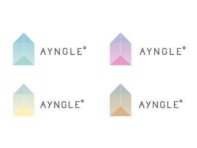
Ayngle Round 2

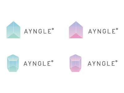
Updated ideas based on feedback from varick, russel and crystal. I played around with simplifying the letterforms, adjusting the prism and tried another prism shape for comparison.
Now I'm stuck on which direction to go with, I like the simplicity of the top two but think the bottom two have more character.