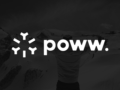
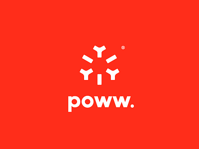
poww. 2015 logo update!
We've been hacking away at this baby for a while now, i was quite satisfied with last years' logo, but since we're going for a more friendly approach (and since fresh powder snow is mushy) i decided to round off the letter shapes, and thicken the poww. symbol.
The type on the poww. logo has been custom since day one, it might look like a futura font, but it was custom from the start. I am interested to see if i can improve upon it some more though. Maybe kerning wise?
Very open to your critique/feedback! I want this to be perfect so bombs away guys!
© Copyright Richard de Ruijter & poww.
Posted on
Jul 29, 2015
More by Richard de Ruijter View profile
Like


