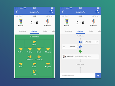
Here is a shot from Betcrunch redesign. The client thought green was too femine, so main color was replaced with blue. Also improved fonts and general UX.
Behance · Twitter · Facebook