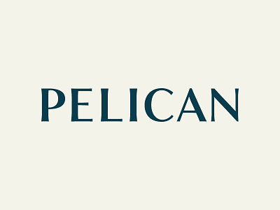
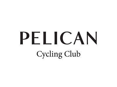
WIP - Pelican Logotype
Thanks to Matt Yow, Mattox Shuler, and Winston Scully for the feedback on my last shot!
Questions: Should the P be opened up a little more? And does the diagonal stroke on the N look lighter than the rest?
Changes: I've exaggerated the serifs a bit, which has definitely given it a lot more character. I also adjusted the top bar on the 'E', made the 'C' slightly narrower, and opened up the 'A' and the 'N' a bit more. A comparison to the last one can be seen in the attachments.
View all tags
Posted on
Jul 6, 2015
More by Matthew Smith View profile
Like


