Sprocket App Icon Iterations


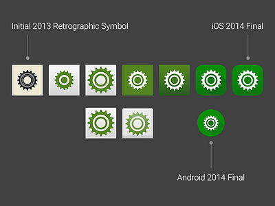
I took the company symbol I had iterated earlier and set it to a monochrome green. I lost that element of the inner lock-ring, so I played around until I had it back. It took some iteration to make it recognizable as a bicycle cog and not any other cog. I then tested the icon on iOS and Android devices and found it too mundane so I inverted the colors. It really started to pop when I tested my green against green hex codes from Google's Material Design Guidelines!
This image suits the brand well, is memorable, works in monochrome and scales optically. I then started to use the color and feel of the icon as the jumping off point for finding the rest of the brand.