Boston Burger Company Rebrand

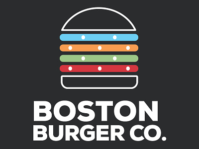
Spec work for Boston Burger Company. The new mark connects two of Boston Burger Company’s distinct traits – Boston origins and unique toppings. The bold colored lines represent both the MBTA subway lines, and the bold flavored burger toppings. While red, green, and orange represent the more tame tomato, lettuce, and cheese; the blue line represents the crazier, or ‘out of the blue’ toppings. Additionally, by shortening the name to Boston Burger Co. it now feels less like a corporation and more like a fun, adventurous dining experience.