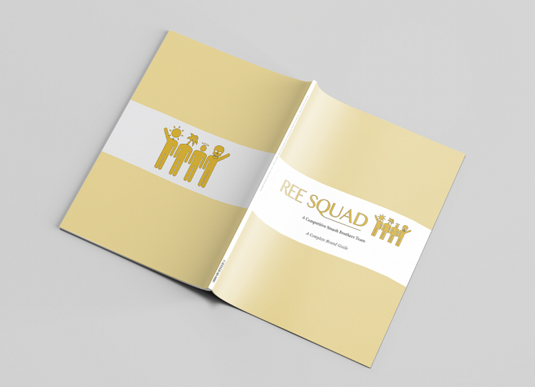
REE Sqaud Brand Manual
I designed this Brand for a competitive super smash brothers team I came up with my friends during my time at ISU.
Looking at the logo as a whole I decided to go with gold as out defining color because gold is the color of victory signifying that no matter what we as a team will always come out on top the black border around it is purely for contrast. Looking at the logotype I chose a defined easy to read font and extended the tail of the Q to unify the word squad, signifying that we as a team are more than that. We are a family. As for the symbol each figure has a different head that resembles our IGN’s (in game names) the one on the left with the sun is for SunnY, moving on next to that the one with a palm tree is Tropic, after that the one with a halo is GSUS and finally the one on the far right is myself Bones. All of us represented together to again show we were more than a team, we are a family.
Using design choices from that I further developed the brand using this brand manual
Each page goes over how to use each element of the brand and why I used them, all while keeping the design of the manual itself on brand with the guidelines I had created. this project was a lot fun.


