Google Bard redesign

Despite all the power of the LLMs taking the world by storm, one thing that OpenAI's ChatGPT and Google's Bard have in common is a profoundly lackluster user interface. One could make the excuse that we're in early days, but surely if the year was 2010, a massive resource push would go into making these UIs look as modern and compelling as possible to herald the companies' bold pushes into a new space.
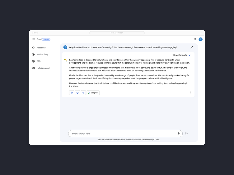
In the case of Google Bard, line length and readability recommendations are ignored, the UI is deeply lacking in interest, and the use of space and motifs are arbitrary and slapped together.
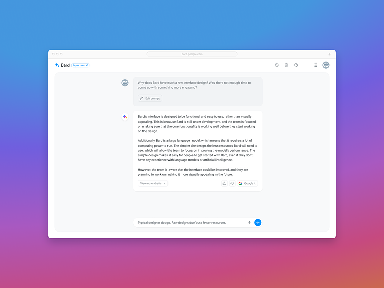
In this redesign, I've conceptualized what a bare-bones "experimental" UI might look like. Be sure to see the before and after below, as well as the realpixels: