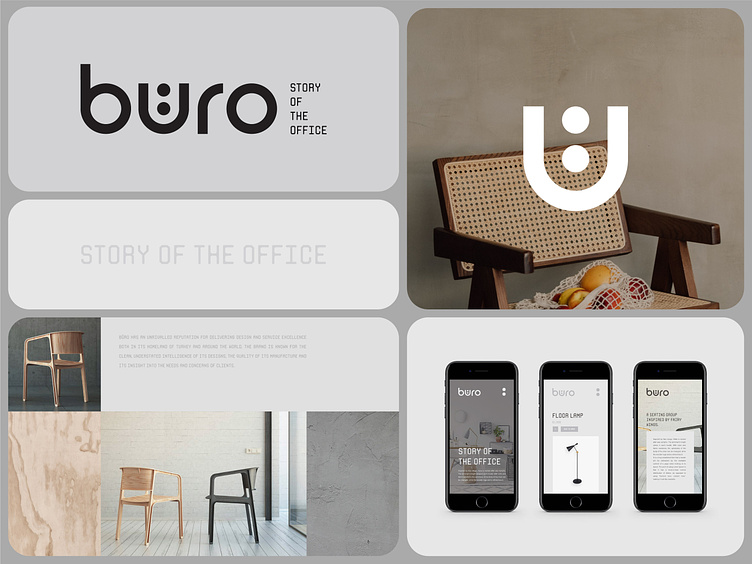
Buro / Architect, Interior Design Branding
Please share your thoughts💭 in the comments and press like❤️ to support our hard work.
Buro is one of our favorite logos. How do you think it happened🤔?
Everyone has their guesses about the reason it is one of our favorite logos🤭. First of all, it is because of its simplicity, and secondly, it is because of the highlighted “u."💁🏻♂️ It is an upgraded letter from the Turkish alphabet. We designed it in this manner to make it more appealing👀 and memorable to curious viewers who wonder why it is this way.
Let's work together!
— Do you have a project? 📩 projects@markaworks.com
— Visit our website to see all the project presentations.
arch
architecture
architecture brand
brand identity
branding
interior
logo
logotype
minimal
minimalist
property
visual identity
View all tags
Posted on
Mar 14, 2023
More by Marka Works Branding Agency View profile
Like


