Brand Concept: Slide

Case Study 👇
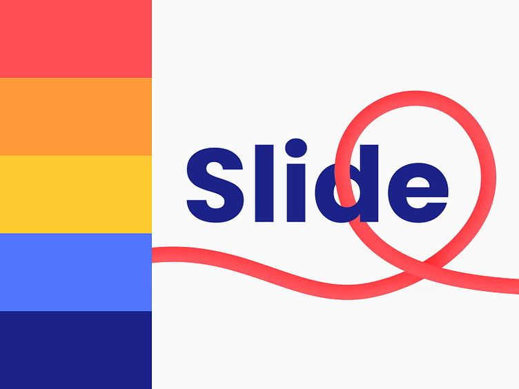
Slide is a modern and minimalist courier brand that offers fast and efficient delivery services.
The brand's identity is designed to be clean, simple, and memorable, using a combination of bold colours, a sans-serif typeface, and a minimal ribbon style.
The brand's main colour palette consists of blue, red, and yellow, creating a bold and eye-catching look that conveys a sense of speed and urgency. These colours are used consistently across all brand materials, including the logo, website, and packaging.
The Slide logo features the brand name in the Poppins font, which is a clean and modern sans-serif typeface that is both legible and distinctive. The letters are spaced evenly, creating a sense of balance and symmetry that complements the minimalistic aesthetic of the brand.
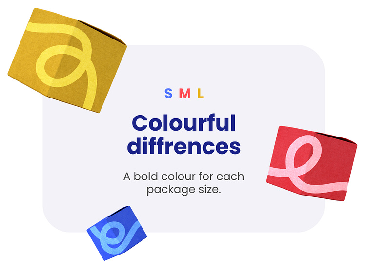
A thin, minimalist ribbon in the brand's signature colours is used as a visual element throughout the brand's materials. The ribbon is used to create a sense of movement and direction, reinforcing the brand's focus on speed and efficiency.
The overall look and feel of the Slide brand identity is clean, modern, and minimalist, with a focus on bold colours, simple typography, and a minimal ribbon style. This creates a distinctive and memorable brand identity that conveys the brand's values of speed, efficiency, and reliability.
Fast, flexible, and reliable shipping