Solid Flat Colour Icons

My website is in constant change, pretty much everyday I take a look at tweaking something. Usually with the goal of creating a super clean, minimal and easy site to visit.
I'm not a web designer or developer, passing knowledge of basic CSS and HTML, so everything I do is born from 'having' to keep things simple, on a technological level. Which in a way is a good thing, I can't get carried away too much with gadgets and cool features.
So my site is still not 'as I would like it', but it's getting their, it's a process of use, interaction... then think how I can reduce elements whilst retaining usability. For example, my right side bar is ugly and not at all how i want it, but something I am working on.
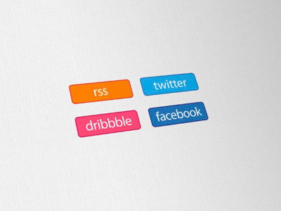
So anyway, these icons are my own little bit of colour and 'call to action' in an otherwise sea of black and white. I don't need fancy effects, shadows of reflections. The very fact that these are the only bits of colour, bright colour, creates the instinctual response to look at them, without them being in themselves, too fussy or detailed. They are not designed to use en masse, just a few select icons to be displayed.
They are inspired from the neat lime green Tweetmeme 'retweet' compact buttons. If you visit one of mu blog posts you will see I have the RSS button side by side at the top.
The essential list of logo design tips and advice
Still playing with location of these icons, top, bottom, not sure yet.