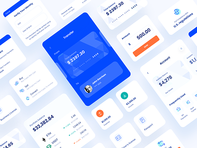
Sila Startup Branding Identity

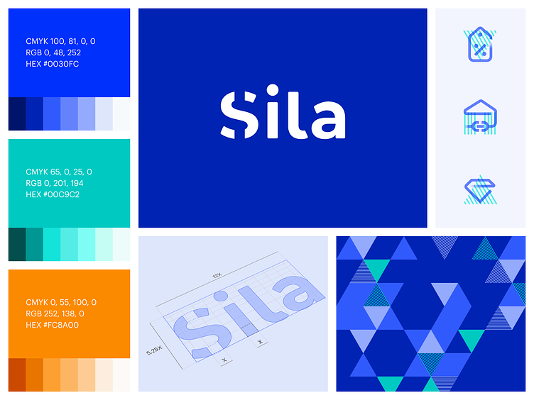
Sila is a financial project about banks and cryptocurrency. Our main task was to redesign the logo based on the letter S. We started the process by studying the shape of the letter S, considering its meaning, and creating many variants of the graphic depiction of the logo. As a result, the client approved the sign, where the letter S looks like a dollar sign. The feature of that option is a part of the letter that is drawn in contour form ― it is not visible.
To ensure the originality of the idea, we analyzed the uniqueness of the logo. Then we selected a suitable font for the sign and finalized the visual design to make everything look harmonious.
We chose a bright blue Oregon shade as the primary color due to the company's location. The patterns are made regarding the Oregon patterns, which consist of triangles. We examined them and created our versions of the icons, which accurately show the connection to the banking sphere.
If you want to see more, check out our startup branding projects
Thanks for your valuable time! L for ❤️
Check our Behance