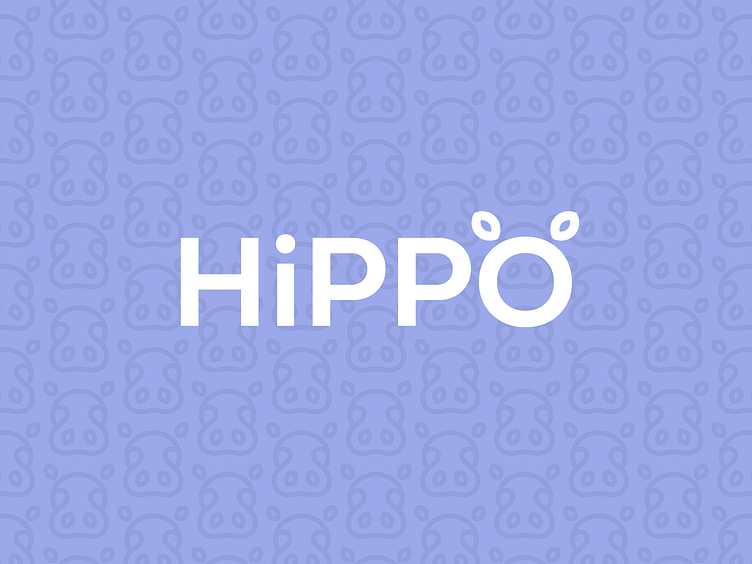
HiPPO

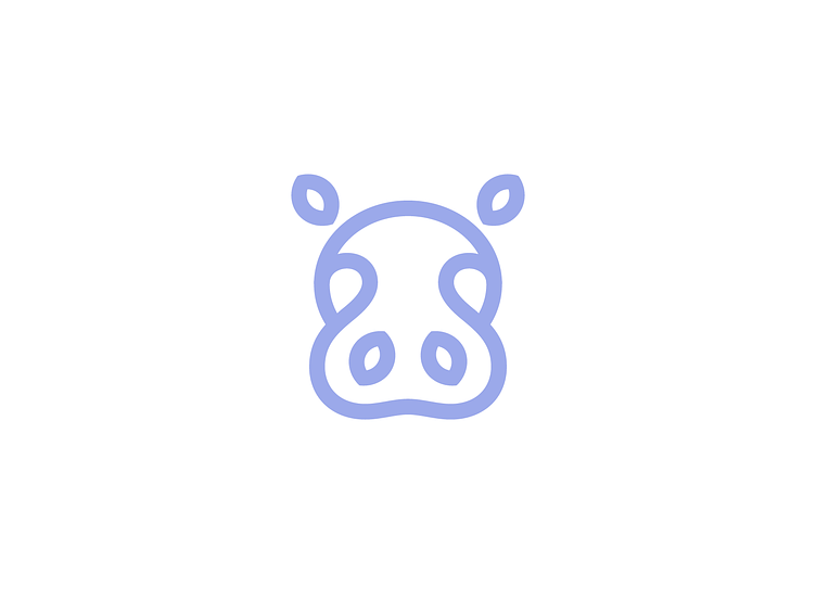
A very clean and simple Hippo logomark concept I proposed in a recent project. The Hippo is drawn by one continuous line with a leaf shape used for both ears and nose to give it a nice eco and greeny feel.

For a project reach out to me at
More of my work
Kreatank.com l Behance l Instagram l Facebook l Twitter