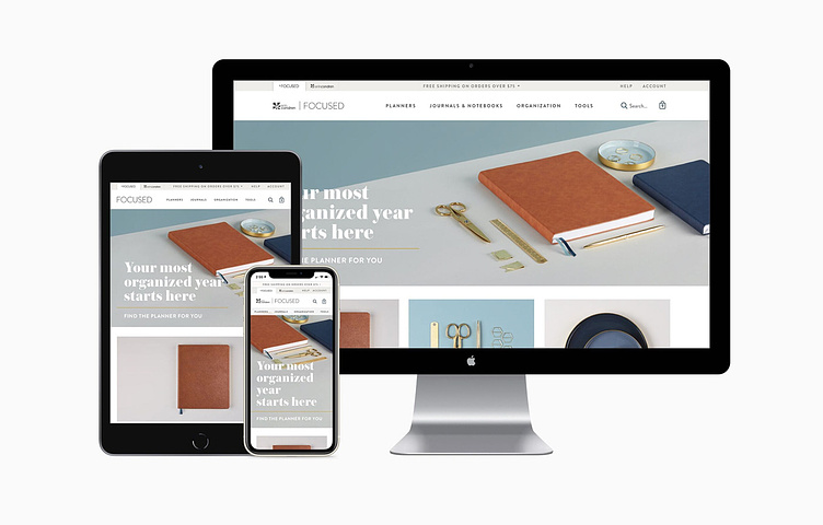
Focused By Erin Condren

Project Description
Research / Content Strategy / UX Design
The Erin Condren brand is iconic. It’s bright and colorful, playful and illustrative. It’s what set the brand apart, but it’s also what deters it from potential customers looking for a more neutral look. The Focused site contains all of Erin Condren’s neutral products on an eCommerce site fully focused on simple UX and clean design elements.
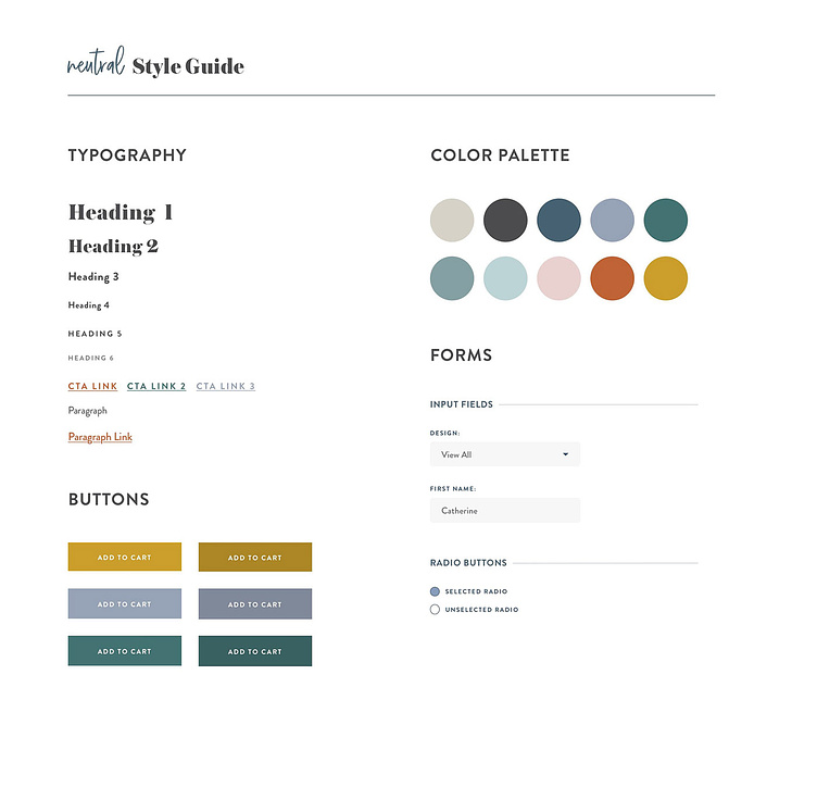
Establishing a Styleguide
The new typography combined clean and legible Gotham with the more playful and bold, Austin, for headers. Color is a key part of the Erin Condren brand, but on this Focused site, the colors are muted and used as accents only.
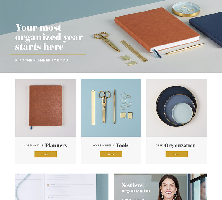
Homepage Design
The homepage is simple and clean. The limited product line allowed for minimal navigation and a light homepage that drives focus onto our main categories. A new style guide was created for photography too, so the imagery was cohesive across the entire site and product focused.
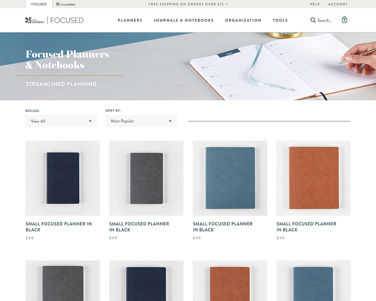
Simple Navigation
Like the rest of the site, simple navigation was the key factor in the category page. All products were photographed on the same background, at the same aspect ratio for easy scannability. Large headers clearly define the current category with bold typography and angled imagery.
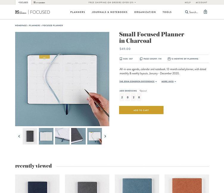
Clean UI
The product detail pages continued the clean UI of the site. Large headers clearly defined the product. Important call outs were complemented with iconography and descriptions were kept short and sweet.