


Erin Condren Redesign

Project Description
Research / Content Strategy / UX Design / UI Design
Over 10 years ago Erin Condren built a $40 million company from the ground up. The company focuses a line of LifePlanner™ organizers, stationery and notebooks. As her products evolved, the website started to fall behind so the team started the project of rebuilding from square one.
We found current pain points through user testing, customer service request monitoring and getting feedback from all departments. New customers didn't get a good sense of what the brand sold or what their story was. Returning customers had a hard time finding what products were new, what was on sale and navigating the site as a whole. Customers were often unaware that Erin Condren had other categories separate from planners.
Redesign Goals
Our goals were to have clear hierarchy, a cohesive style, easy navigation and a mobile friendly experience. The Erin Condren site had many issues that resulted in a sub-par user experience.
Increase Clarity: The homepage lacked a sense of hierarchy. When users landed on the page, how could they tell what was important? Everything was a similar size, with different colors and typefaces that made it hard to focus on any one thing.
Establish Guidelines: The different designers at Erin Condren didn't follow one style guide, so multiple competing fonts, colors and photographic styles were used that resulted in a chaotic style.
Improve Navigation: The navigation featured multiple icons in various colors with no clear hierarchy. The navigation categories were hidden away in a push menu, so new users were unable to see what products Erin Condren carried at a glance. This also meant an extra click before any customer could start shopping.
Optimize the Mobile Experience: The promotions on the homepage were flattened, unoptimized images that provided no SEO value and became illegible on mobile.
Competitor Research
I complied a list of every major planner and stationery company to review. I took screenshots of storefronts, product detail pages and checkout systems to establish how the flow from introduction to purchase was being handled by our competitors. I also researched the top 100 e-commerce businesses to learn what design standards were being used across the board. I spoke with our customer service team to learn what customers were having issues with and complied a list of top complaints to consider during the design process.
Brainstorming
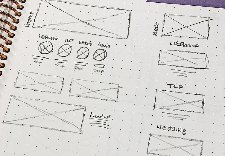
With our goals clearly set, I started to sketch out ideas. For a project as large as a storefront, I focused on sketching out specific ideas that focused on one of our goals rather than a whole page. For example, to showcase our product categories I explored ideas that had a list of categories on the homepage, a grid system that featured imagery of each category and how to split out each product line within a navigation bar.

Establishing Wireframes
Rough sketches were refined into various directions through wireframes. Some explorations included large full-width story blocks, using handwritten typography for a crafted design and a large Pinterest style grid to showcase products. The above wireframe was chosen for the ability to showcase various categories and information in an easy to digest manner.Enter your text here...
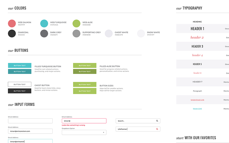
Creating A Style Guide
Establishing a style guide for the website was a critical need. Cohesive stying for the home page with header, paragraph, link and button styles that all designers must follow, elevated the storefront to match the quality of the products.
Updated Navigation
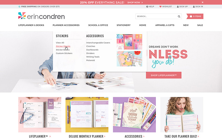
The new navigation featured all of the main categories at the top of the site. This gives new customers a solid understanding of what products Erin Condren carries. On hover, subcategories appear in easily scanned columns. Image blocks allowed specific products to be featured and gave customers a clear visual. A common e-commerce practice is to use an eye-catching bar at the top of the screen to drive users to take specific actions and to inform them about limited time offers. I designed a simple and adaptable bar that could be activated during a promotional period to help drive attention to it. Before, sales were only promoted on the homepage, so if customers landed on a different page, they would miss this important information.
Clear Product Features
To help make secondary categories easily available, I designed 4 simple blocks underneath the hero image that promote any category in a visual manner. For holidays we can focus these categories on gifts or at the start of the school year, shift to student & teacher related items. 3 blocks underneath showcase secondary launches and news on the homepage. These feature a large space for photography and a clear call to action to start shopping.
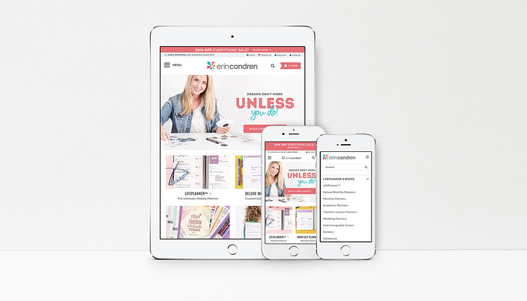
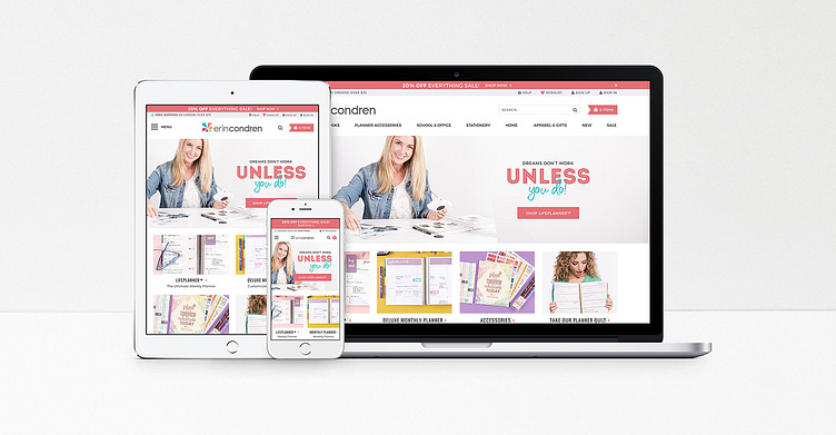
Fully Responsive
The mobile site now featured live text so that headlines and descriptions are readable on the smallest devices. To showcase the large product line up, a push menu is used for navigation on devices smaller than a tablet. For easy access, the main categories are promoted on mobile devices separately from the push menu.
Results
The storefront refresh was a success. Conversion was up and bounce rate was down. I worked with the executive team to establish areas that needed further attention and designed a solution that resolved every problem. The new site is modern and easier to navigate. New customers have a clear understanding of what the brand sells and returning customers are able to see what's new and on sale quickly. Rather than a plethora of sales right from the get go, the new storefront features beautiful imagery to sell a lifestyle instead. This results in a better first impression that showcases the heart behind the products instead of the price cuts. While staying true to the established brand style, the new design brought simplicity and ease of use to the forefront.