Bruiser Neon

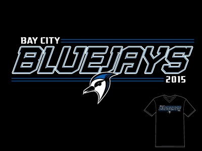
I had performance tees in mind when I created this design. I wanted something dynamic, but that would also be sparing with the ink. Usually with performance tees (the synthetic quick dry shirts) it's best to avoid using a lot of ink because if you do, it will sit heavy on the garment and the wicking of the fabric will be impeded in those areas. Many times, only small central chest designs are printed. I created a full front design with thin lines that would avoid any really big blocks of ink by thinking about the text as neon lights that would be illuminated around the outsides of the letters. Licensed to BruiserArt.com