


Bluejay: Brand Identity & Web

About the project
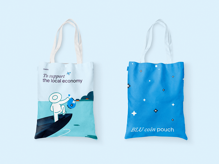
Bluejay is a capital-efficient protocol for local multi-currency stablecoins in Asia. In simple words, Bluejay creates web3 infrastructure that supports local businesses.
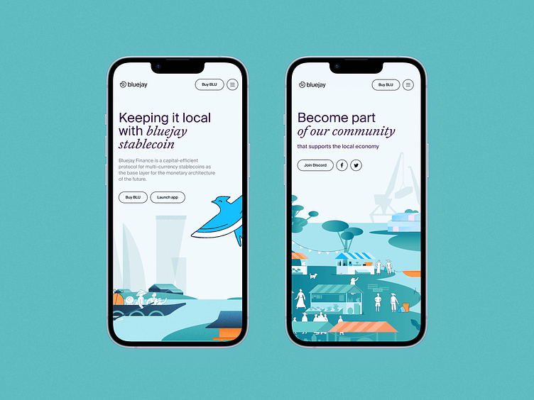
Bluejay is all about “keeping it local”. It embraces local Asian currencies, so it was important for Embacy to emphasize this in the visual identity.


Concept
The concept is built around the notion of an “intercultural port”, as the biggest Southeast Asian cities are. The key visuals demonstrate an established infrastructure in which many different businesses can comfortably exist in the same space, opening up new opportunities for themselves.
There are three key visuals:
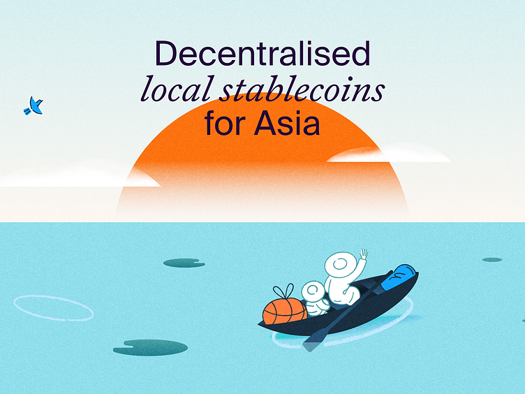
Characters crossing the port during the sunrise are accompanied by a Blue Jay. This key visual highlights the caring feature of the brand.
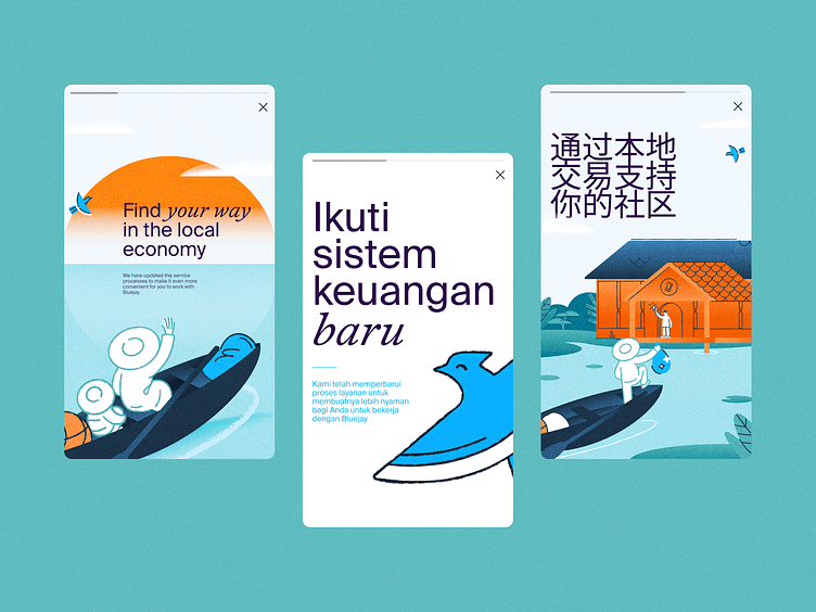
Characters are exchanging different assets while Blue Jay is near to help them.
Landscape view of the port where characters are interacting with each other.
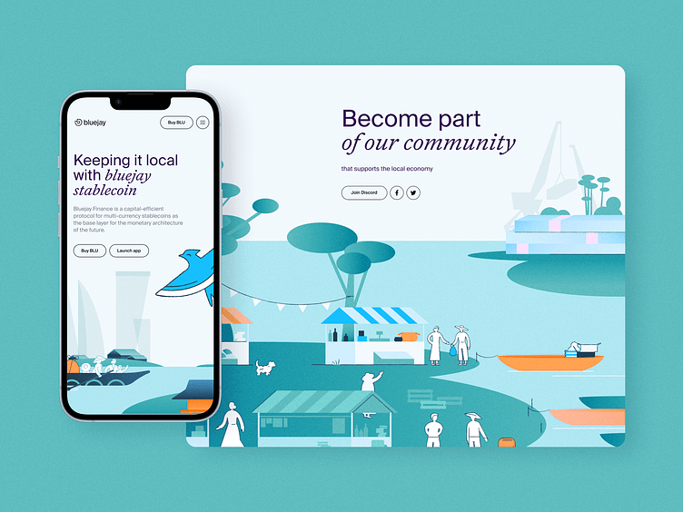
Every key visual includes a rich amount of Southeast cultural elements such as costumes, architecture, local fauna and port background.
Illustration
The general vibe of the illustrated port is a symbiosis of traditional and industrial. This way, Embacy emphasized the innovative nature of the crypto-community while sticking with the cosiness and cultural uniqueness of a busy Southeast harbour.

Logo
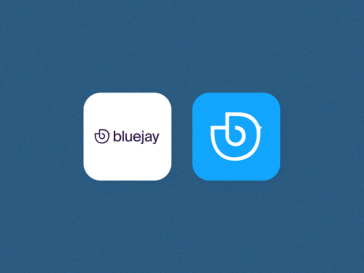
The main sign of the logo is the image of a small blue bird (referring to a Blue Jay), which is formed around the first letter of the company name Bluejay.

About us
We are a global design agency focusing on tech companies and digital products, with more than 200 projects accomplished for clients from Australia, California, Norway, and South Africa. You can look through our projects here.
Follow us on Behance | Instagram | Facebook | LinkedIn
More about us on embacy.io
Have a project? Shoot us a letter at hello@embacy.io