KAMP Hawaii - nonprofit youth org branding


Final approved branding for KAMP Hawaii, a Hawaiian-based nonprofit youth organization. Client approved this concept AS IS. How often does that happen?
2x for detail, and check the attachment for more images. Also, be sure to check the full branding presentation on my website:
http://www.atomicvibe.com/work/#/kamp/
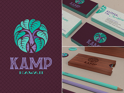
This concept focuses on a Kalo (Hawaiian name for Taro) plant. Kalo is an important symbol, because it's not only a staple in the Hawaiian diet, it's also woven into the very fabric of Hawaiian culture.
At the center of this design is the Kalo root. Inside it is a figure that represents Haloa, the child of Wakea (Father Heaven) and Ho’ohokukalai (the stars). Haloa is symbolized in Hawaiian folklore by the Kalo plant, and represents the original ancestor of the Hawaiian people.
Surrounding the root are eight heart-shaped Kalo leaves which symbolize the eight main Hawaiian islands.
Mahalo.
