LAK Gallery: Case study

LAK Gallery is an international gallery that displays limited edition contemporary pieces of art in furniture, ceramics, and sculpture. We've built their marketplace from scratch with technologies like Next.js, TypeScript, and Sanity as a Headless CMS.
Requirements
Minimal design, easy-to-use CMS and fast load:
LAK Gallery needed a highly aesthetic minimal design to highlight showpieces and provide a user with a simple and pleasant experienceTo be a leading marketplace in the luxury space, LAK Gallery's site needs to be fast and abide by the best practices.They also wanted the content to be easily uploaded and managed by LAK Gallery’s curators.
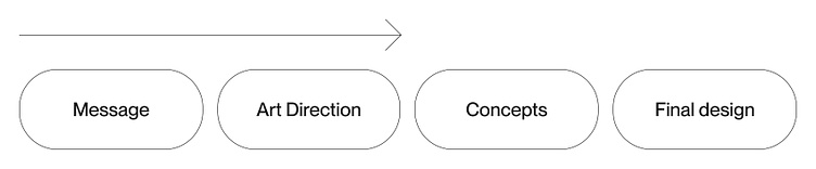
Design Process
1 — Understanding the client:
First, we discovered that the key value of the client’s product is aesthetics and creating the feeling of owning a work of art.
2 — Identifying the message:
LAK Gallery presents a bold and refreshing style via sculptural and inspirational pieces, presenting a delicate and accurate perspective of modern design.
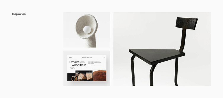
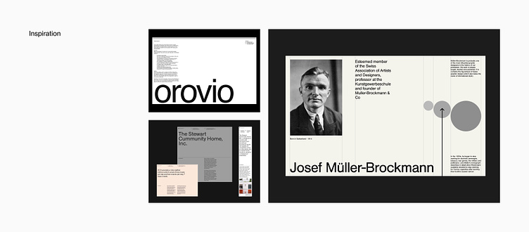
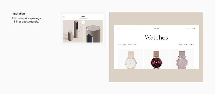
3 — Defining art-direction:
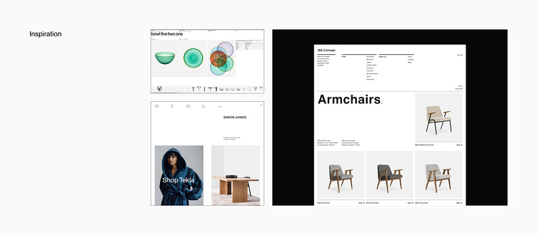
As an inspiration, we used minimal visuals, compositions with huge counter space, huge image formats, and clean neo-grotesque fonts.
4 — Creating concepts
We’ve created 10 different visual concepts for the client to choose from.
5 — Delivering final mockups
After the key visual was selected, we created all pages of the website in the style chosen, including responsive design.
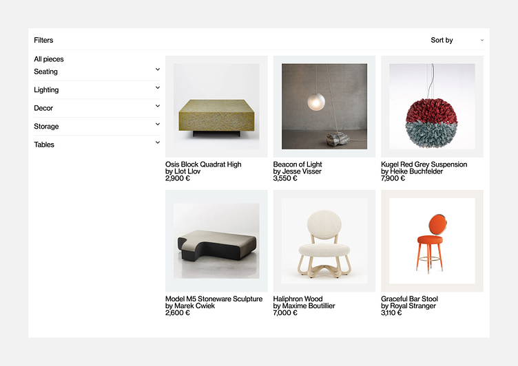
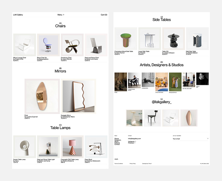
Color
The high contrast color scheme is aimed to convey purity, clarity, simplicity, and at the same time sublimity of high art.
As a background color, pure white creates a sense of lightness, purity, balance, and spirituality. In contrast combination with black, it gives precision, clarity, and prestige.
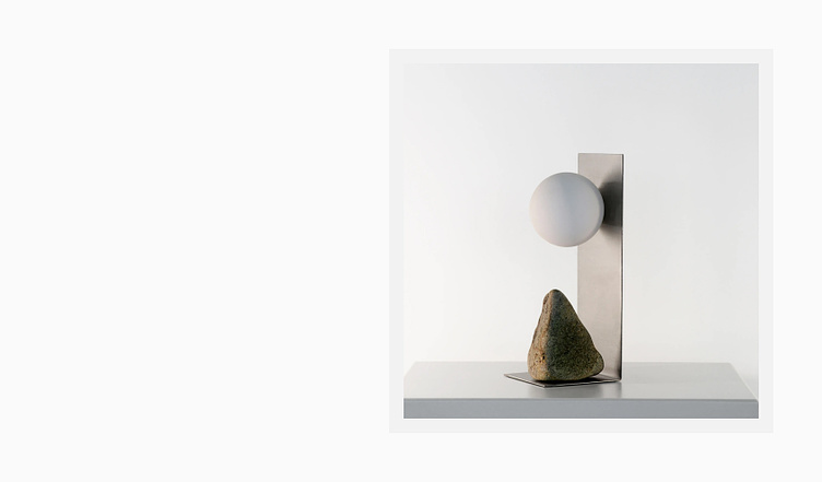
Earth materials in pastel tones to highlight the style of selected gallery items.
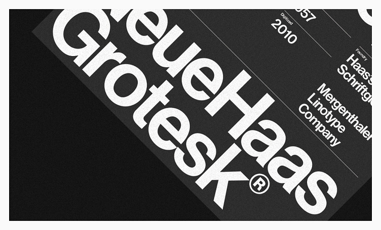
Typography
Using a bold sans serif typeface we captured the modern style of the overall project. The typography should highlight pragmatism and minimalism, and be brutal enough, but simple and functional.
Neue Haas Grotesque — The font is representative of the functionalist Swiss Typography and is associated with the Bauhaus design school. This font is also about pragmatism and makes every message even clear.
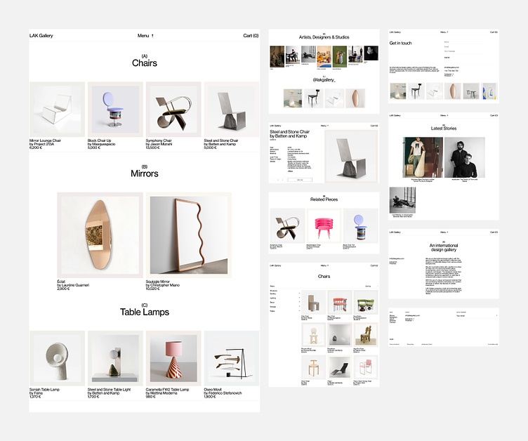
Composition
The composition should create a sense of clean and free space to give more attention to showcased art pieces, however, it should be structured to create an association with a magazine catalog and make it easier for a user to search for items he is interested in.
Graphics
The theme of the brand's design is clean and minimalistic, which enables the artworks and artists to shine. Furthermore, the website's design and subtle motion graphics don't distract from the art pieces, but rather elevate them.
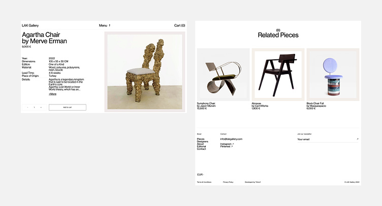
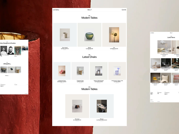
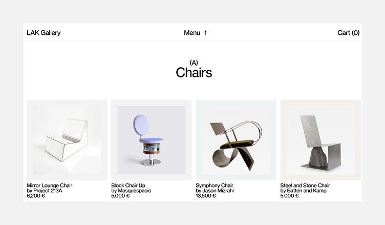
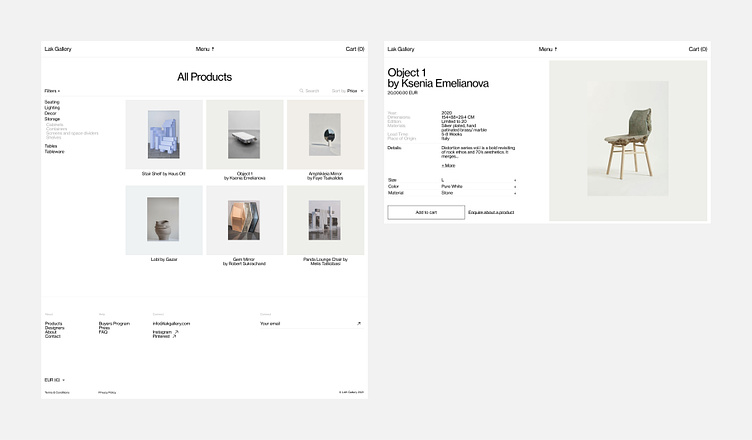
Final design
The theme of the brand's design is clean and minimalistic, which enables the artworks and artists to shine. Furthermore, the website's design and subtle motion graphics don't distract from the art pieces, but rather elevate them.
"We started from zero, Tinloof took care of designing and developing the website from scratch, and now our clients keep complimenting us and coming back to buy the latest pieces we advertise."
Mamoun T
Co-Founder