


Peon — FMP Logo and Branding

The Brief: To create a dystopian scenario whereby the design industry has become more corporate and design services are becoming more centered towards "bidding sites", Clients would post their brief and designers must compete for the job, constantly lowering their salary in the process in order to compete and win against competition. Clients would expect designers to submit concepts and work prior to being accepted to the brief, with the client selecting the best work that follows their standards. The aim of my FMP (PEON) is to refect this undesirable future that will be used as a warning of the dangers we could possibly face as young practitioners.
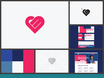
The Outcome: Peon is a global online marketplace for freelance services. Peon’s platform connects freelancers (sellers) to people or businesses looking to hire (buyers). Buyers will sign up to a free account and post their brief to the platform. Freelancers would then have to respond with a designed mockup for the project. The buyer can then select a freelancer and mockup that best reflects their creative vision. The clear downside to this is that freelancers will potentially work for nothing as there is the high chance they wont be selected to work with the buyer as there will be fierce competition with other freelancers in an over saturated market. The Peon brand includes a heart shaped logo. On the surface, this logo has a friendly and approachable appearance. However, the logo also sports 3 diagonal lines which in Hobo Code represents "an unsafe space". The brand also makes use of an cyberized "glitchy" theme to their marketing. To them, this is an exciting way to cyberize their brand and to present themselves as the way of the future for freelancers in the digital space. This also as a double meaning, where the "glitch" they use can also represent a broken system or a malfunction.