Nashville Sounds | MiLB Brand Identity

Nashville Sounds | MiLB Brand Identity
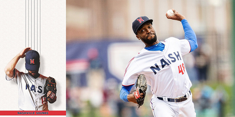
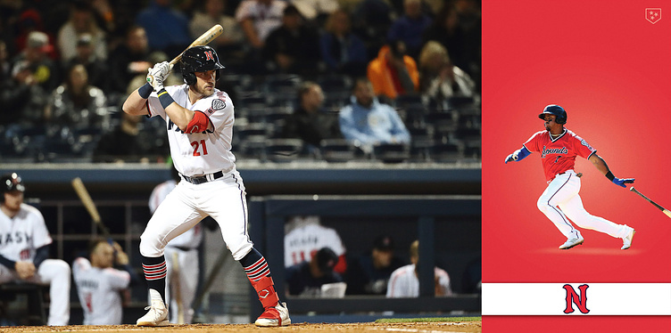
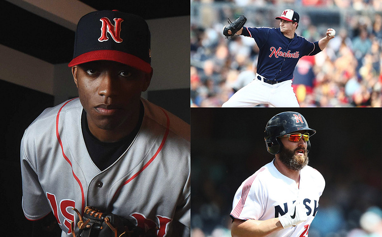
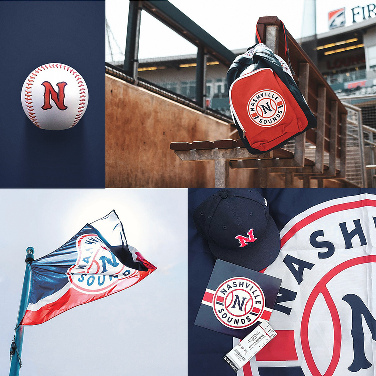
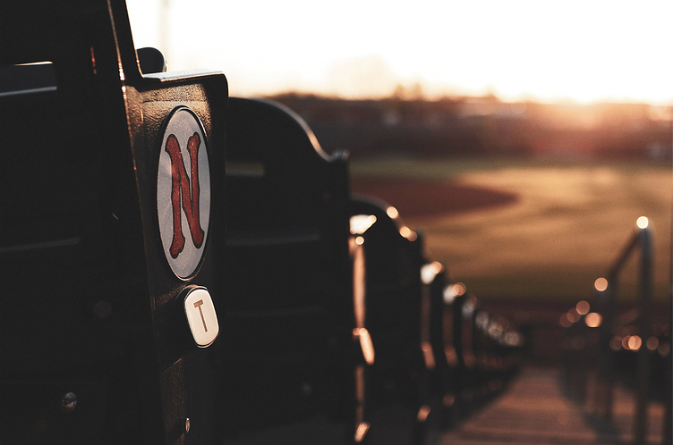
The Nashville Sounds - MiLB affiliate of the Texas Rangers - approached Rare Design in 2018 with the aim of creating a new brand identity for their club, fitting of a major league ball club and reflective of the team's rich history and Nashville's vibrant personality.
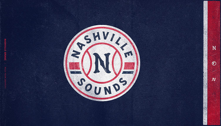
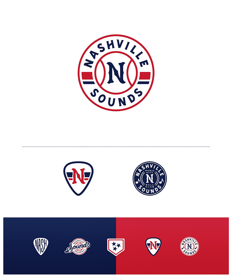
Without being too heavy-handed, the new identity had to authentically connect to Nashville and resonate with its community. Ultimately, we combined historic baseball lettering, classic scripts, wood-block typography, and musical motifs with local icons to strike a cord that was in tune with the team and their town.
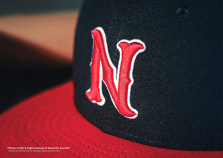
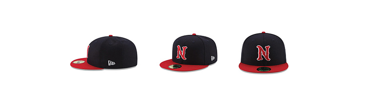
My contribution to the rebrand was in the development of the visual identity, and most prominently, the team’s primary ‘N’ lettermark. However, just like the ball club, the design work was a full team effort led by Rodney Richardson and executed by the entire Rare team. Info & links below.
Project Credits
Agency_ Rare Design
CD_ Rodney Richardson
PM_ Marie Siegfried
Designer_ Cody Bass
Designer_ Brian Bollig
Designer_ Ben Barnes
Designer_ Jeremy Nelson
Links
Full Case Study: Nashville Sounds Rebrand
jeremynelsondesign@gmail.com
JN
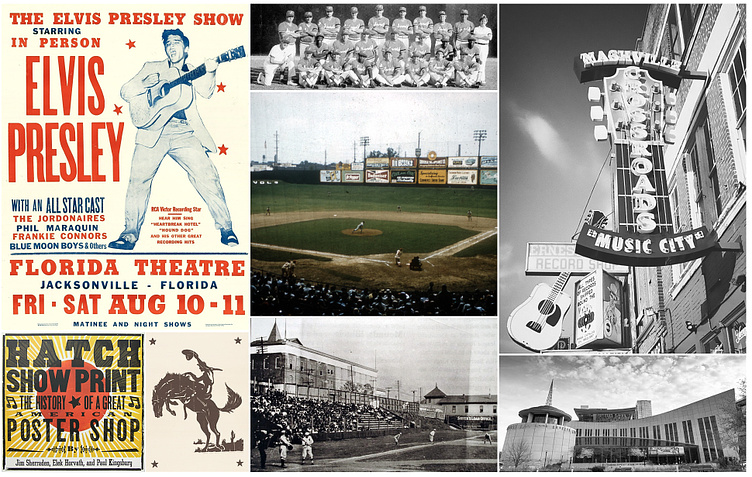
For the Sounds, it was a priority that the new identity captured the spirit of Nashville & embrace their heritage of baseball.
To ensure our proposed solutions would meet these goals, we relied on the iconic work of Hatch Show Print, classic and decorative baseball lettering, and the sights of Nashville's music scene (Shown above) to inform our exploration and concept development (Below).
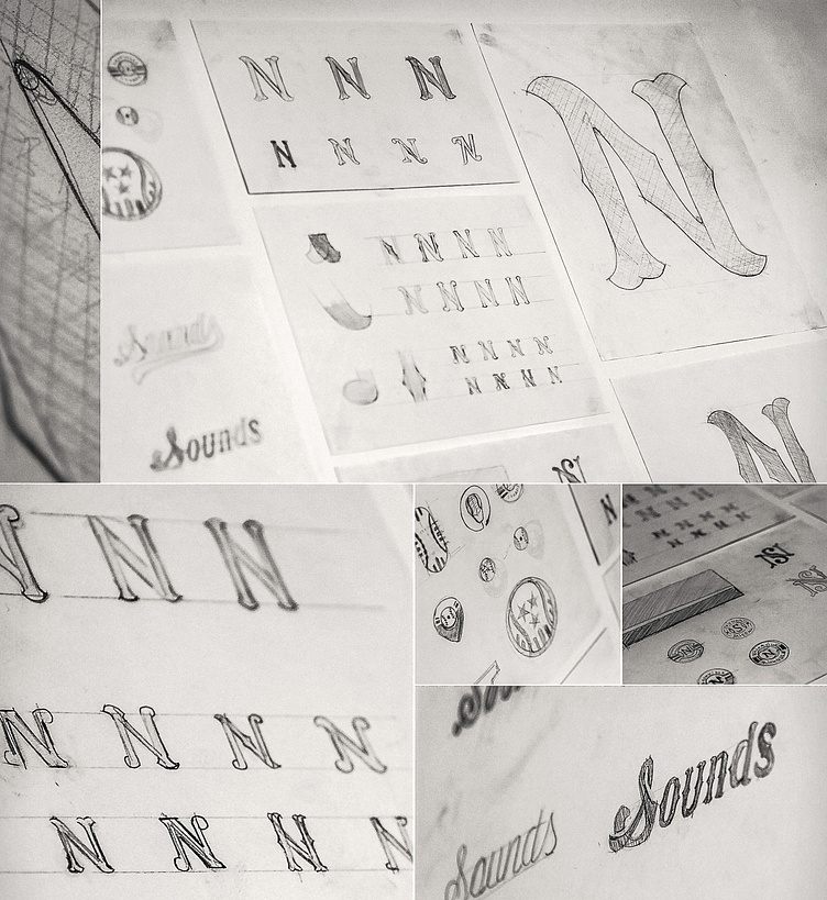
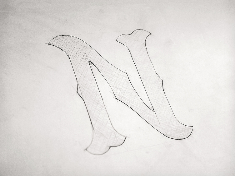

Though subtle, and visually similar to decorative spurs seen in display type and classic sports lettering, incorporating the form of a guitar's F-Hole into the diagonal stroke of the 'N' connected baseball with Music City naturally in both concept and execution.