


Duluth Typography

Calling all Type Nerds!
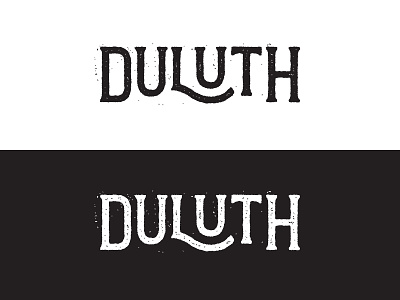
I need some input on this type. How do y'all feel about the kerning between the L and U? I fought with that for a while and landed here.
Overall, visually it feels balanced, but does it need to be tightened up a bit? Would love your input. The rest of the project will follow once I get this sorted out.
Cheers