


Unable logo guidelines


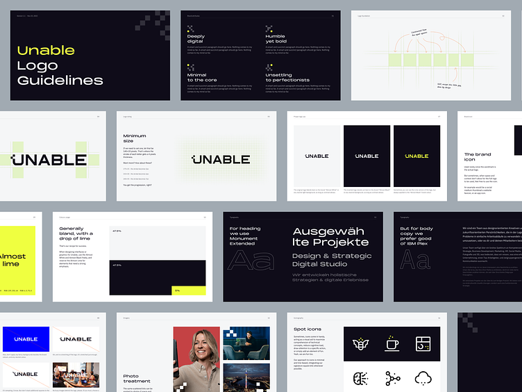
Unable is a design and strategic digital studio run by Alex. I had the chance to redesign the company logo alongside a detailed logo guidelines booklet to ensure consistent use by the company‘s marketing team.
The wordmark is constructed on the foundation of six equal-width rectangles, except the one for L, for the sake of proper kerning. Each letter is a custom-designed shape that fits in an aspect ratio, giving total flexibility to using the wordmark in various sizes without losing its crispness.
A good companion to a logo is a logo guide.
And inside, the usuals. You know, all the visual suggestions meant to be broken as the brand evolves.
ˋˏ✄┈┈┈┈┈┈┈┈
Need a logo?
Visit www.ensage.co