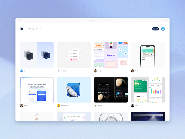
Layers redesign
The new Layers community caught my interest, and so I decided to give it a redesign to see where I might take things.
I went with a more of a conventional rows/columns layout rather than Liam's masonry layout as enforcing a canvas can lead to its own forms of creativity, is easier to scan, and feels less messy. I also created a new logo for the community, which feels more balanced and contemporary. Lastly, I raised the saturation of the elements to make them feel more approachable
See below for the before and after, as well as links for the realpixels:
More by Eli Schiff View profile
Like


