Button Height

Thought I should share this.
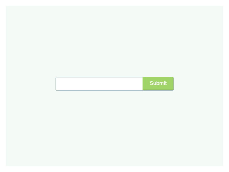
So, I saw this website recently and it somehow bugged me all of a sudden because I used to do that and now felt it was so wrong. We tend to give the buttons depth with that inner shadow from the bottom, but we don't take into account that the button should be taller than the input field because it's above and tilted the way it's made.
Yeah, it looks better when the button doesn't go out of the boundaries of the input field and we're fine with that usually, but should we? :)
@2x for better view