LT Design System

Overview
Background
This design system was created as a project for a design system bootcamp by Molly Hellmuth, who is the creator of UI Prep.
Structure
Styles
Color
Typography
Container
Grid & Layout
Icons
Components

Color
Color Key
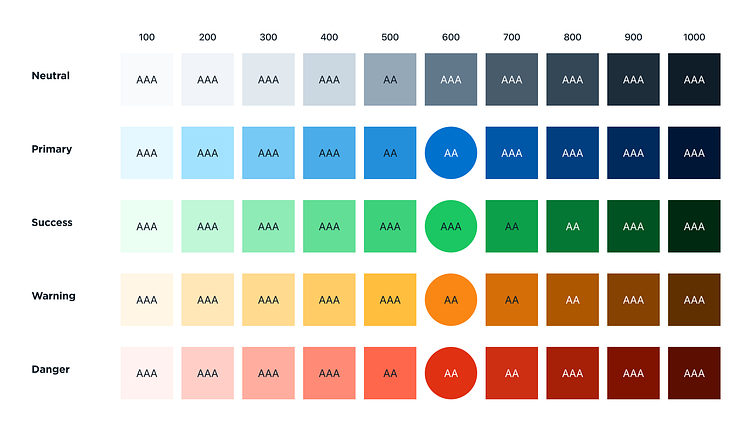
To set up a color style palette, I created a color key that included a wide range of tints and shades (10) for each color and addressed accessibility.
The quickest and easiest way to do this was by copying/pasting existing color palettes from popular design systems such as:
For customization, I updated each color category by its hue value (with the help of a Figma plugin called Batch Styler, but colors have to be added as styles for this to work) for each tint/shade while keeping the brightness and saturation values as they are (assuming accessibility contrast passes, otherwise brightness and/or saturation should adjust slightly).
I made my Primary and Neutral colors feel related by using the same hue value for each (ex. 207). The large difference in brightness and saturation will make them appear distinct while still sharing the same coolness.
Warning colors are usually yellow, which is a tricky color to work with since it's very light naturally — making it hard to see and appearing “muddy” when the brightness is lowered. As a workaround, I adjusted the hue of tints towards 40 (yellow) and shades towards 30 (orange).
To ensure every color was accessible, I tested their contrast ratio with off-black (Neutral 900) or white text. When a color did not meet or exceed contrast ratio 4.5:1 for AA, I slightly adjusted the brightness and/or saturation values until it did.
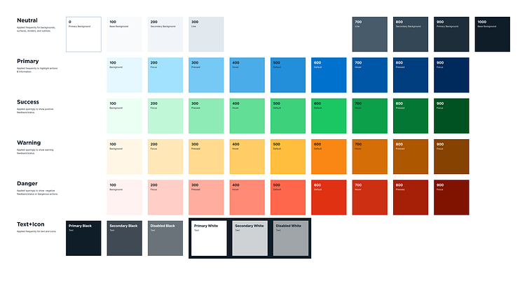
Color Styles
To identify the base and tints/shades needed for the design system, I considered which color variation is required to support backgrounds and different interaction states (ex. Default, Hover, Pressed, etc.).
The next step would be to turn each of these into Color Styles so they can be applied across my designs, but I already did it beforehand to use Batch Styler plugin to adjust hues. So, I simply removed any that were not necessary.
For proper naming convention and organization, I named each style with forwarding slashes (”/”) to create a nested hierarchy. In addition, I added a helpful description for each. For example:
Primary/100 (Background)
Primary/600 (Default)
Primary/700 (Hover)
There were some extra styles I added along the way, which were:
Neutral/0 for white (#FFFFFF)
Text+Icon palette for primary, secondary, and disabled
Gradients (example use case could be for charts)
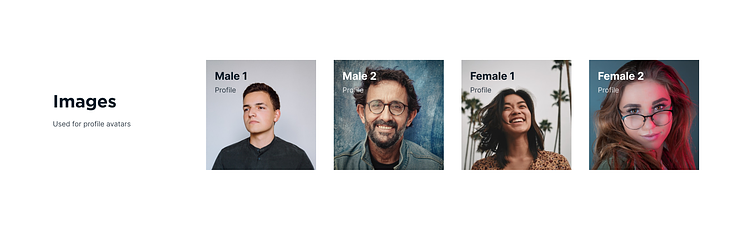
Images for profile avatars

Typography
Font family
Gotham for headings
Inter for subtitles, body paragraphs, button, and label
Type scale
1.200 - Minor Third
Weights
Bold for headings and subtitles
Regular for body paragraphs and label
Medium for button.
Letter spacing
-1% for headings
0 for subtitles and body paragraphs
2% for buttons and label
Line heights
Divisible by 4

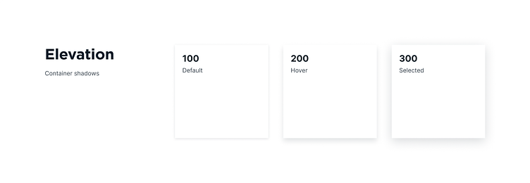
Container
For simplicity, I went with a few basic elevations and changed shadow color to Neutral 1000 (0F1D29).
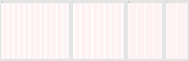
Grid & Layout
XL
Columns: 12
Type: Stretch
Width: Auto
Margin: 32px
Gutter: 24px
L
Columns: 8
Type: Stretch
Width: Auto
Margin: 32px
Gutter: 24px
M
Columns: 4
Type: Stretch
Width: Auto
Margin: 16px
Gutter: 16px
S
Columns: 2
Type: Stretch
Width: Auto
Margin: 16px
Gutter: 16px
Icon
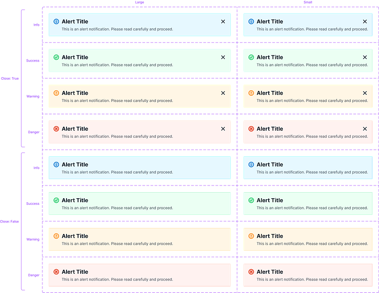
To setup icons, I chose Material Design, specifically sharp tone version at 24x24 as a default size. The icons I added were selected to cover common use cases. Afterwards, I categorized similar icons as component sets and renamed components, properties, and values accordingly. Furthermore, I changed almost all of the icons' color to Text+Icon Primary Black, except for the Alert set (each variant has its own color).

Components
Here are components I have created so far, from A-Z:
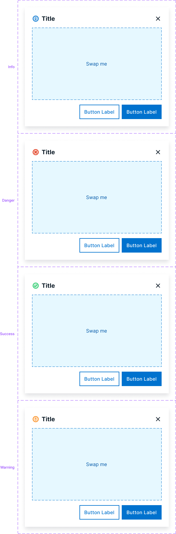
Alert
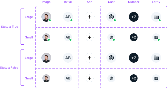
Avatar
Badge
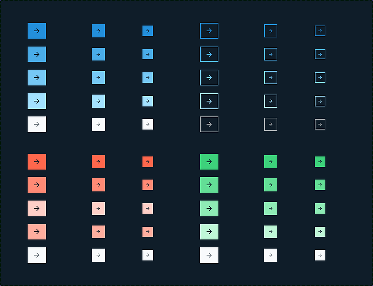
Button
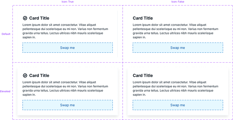
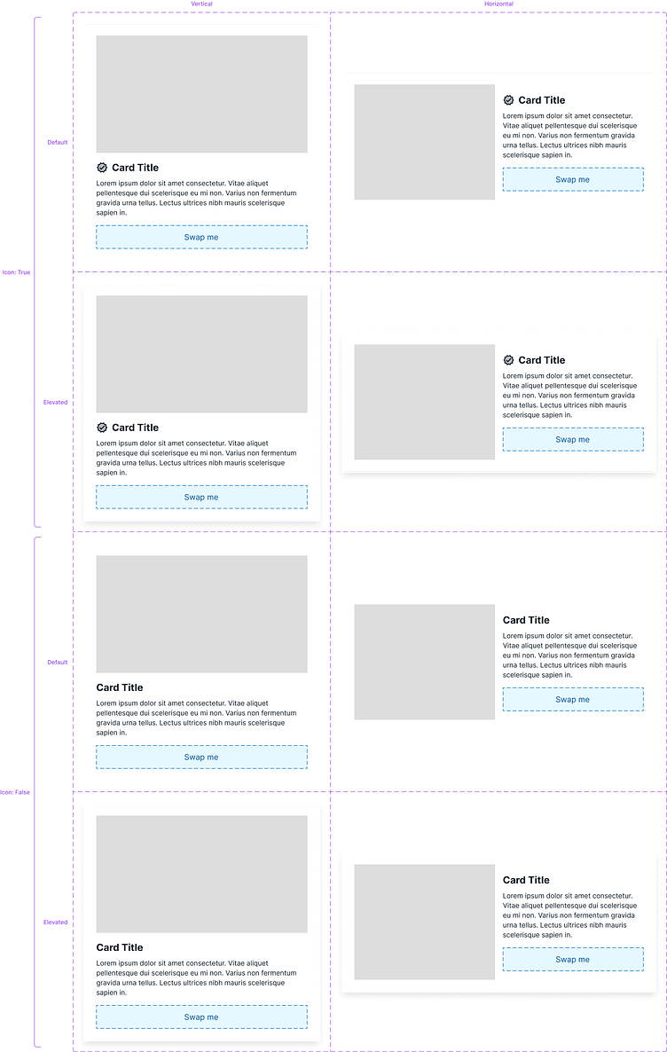
Card
Dialog
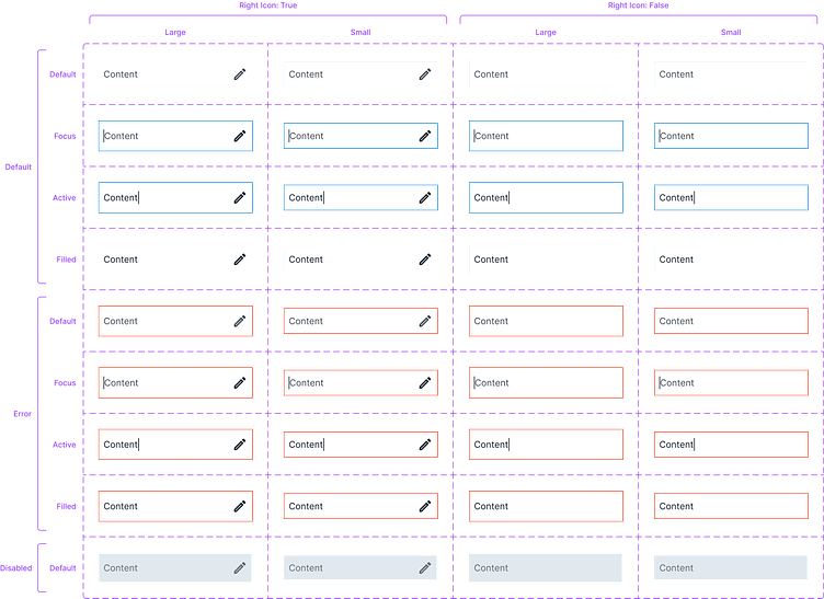
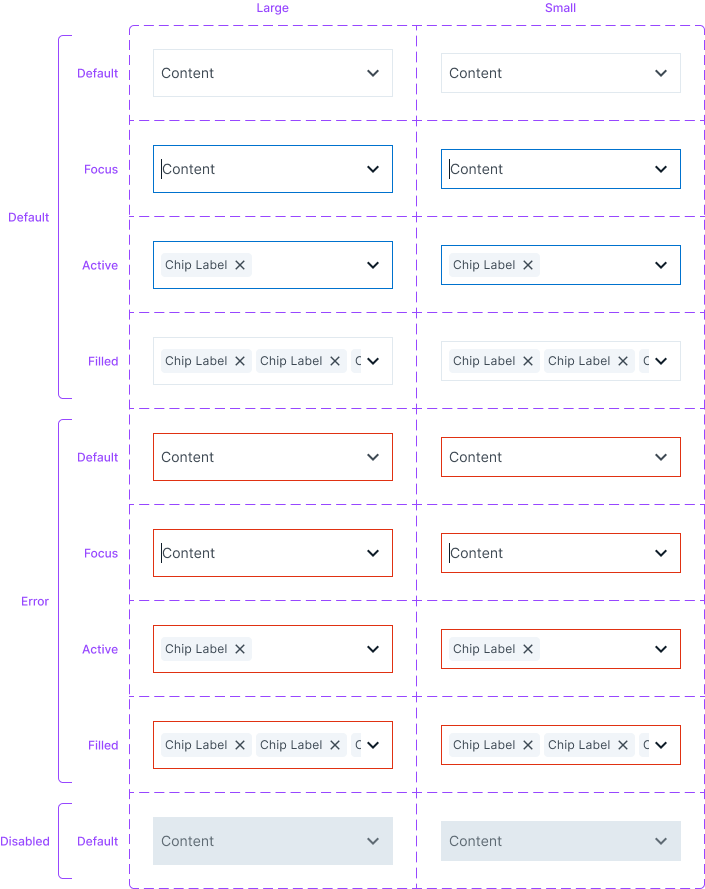
Input
Search
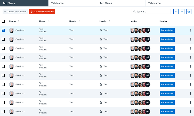
Table
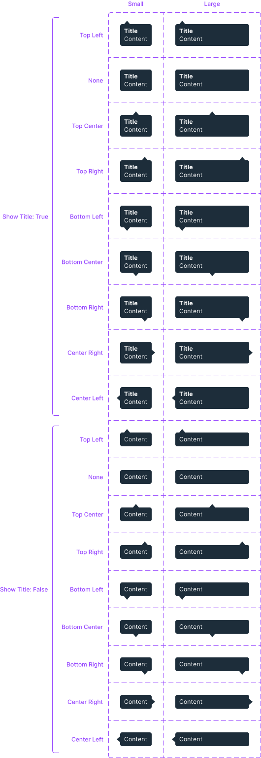
Tooltip
Alert
Avatar
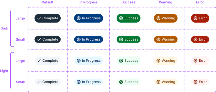
Badge
Button


Card
Dialog
Input


Search

Table
Tooltip
Final Thoughts
Propstar is a great Figma plugin to show all possible component variants
Slot component is a mental model that helps create flexible components
Next steps would be to add more components and add documentation