Defispot - Case Study


Hi all,
Defispot is a multichain decentralized exchange (DEX) that aims to make it possible for users to swap, lend and add/remove liquidity to cryptocurrencies without needing a centralized third-party or requiring users to provide Know-Your-Customer (KYC) details.
View Project ↗
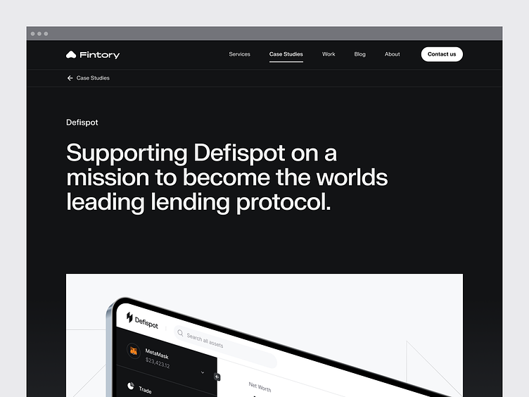
Supporting the new leading brand in crypto
We teamed up with Defispot, a big player in the crypto space, for an insightful and complex project: we were commissioned to create an entirely new brand identity, design system, website design, and UI/UX design across all of their platforms.
The challenge: creating a design that makes complex matters such as crypto and web3, simple. See, how we’ve overcome this issue.
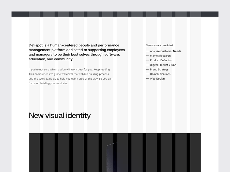
Defispot is a multichain, decentralized exchange (DEX) that makes it possible for users to swap, lend, and add/remove liquidity to cryptocurrencies without the need for centralized third parties or requiring users to provide Know-Your-Customer (KYC) details.
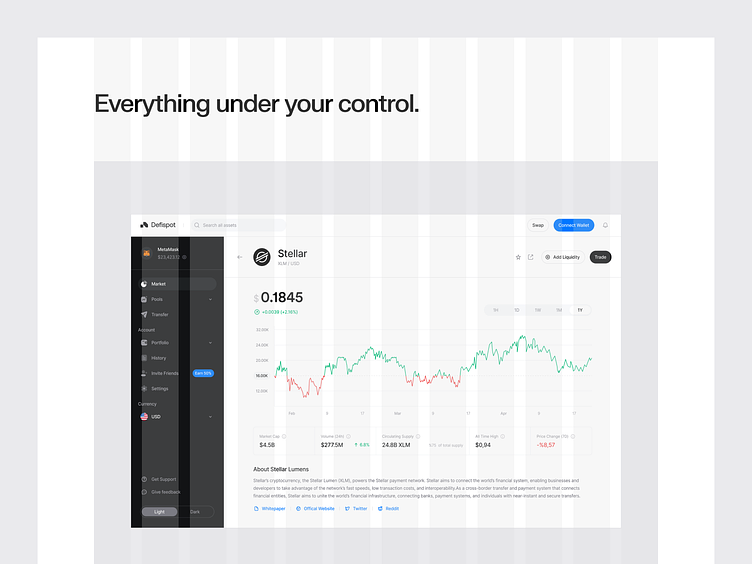
Removing third parties adds independency - and more personal responsibility. Therefore, it was therefore imperative for Defispot to provide their users with transparency and a sense of security. And most importantly, we needed to implement design elements that simplify complex matters to reduce the cognitive load on the user.
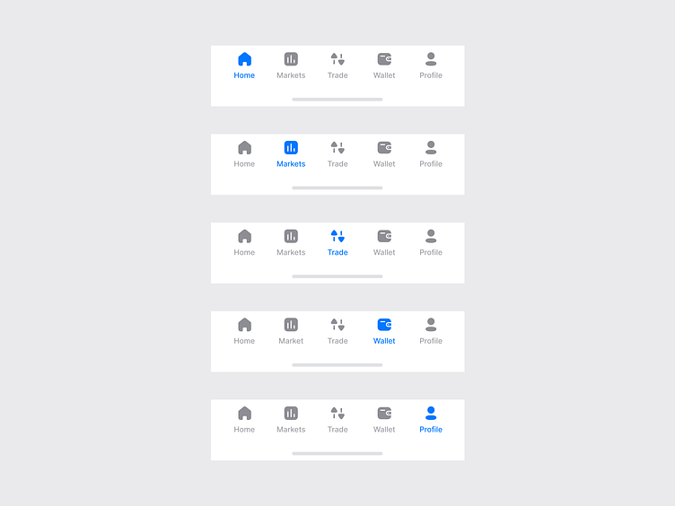
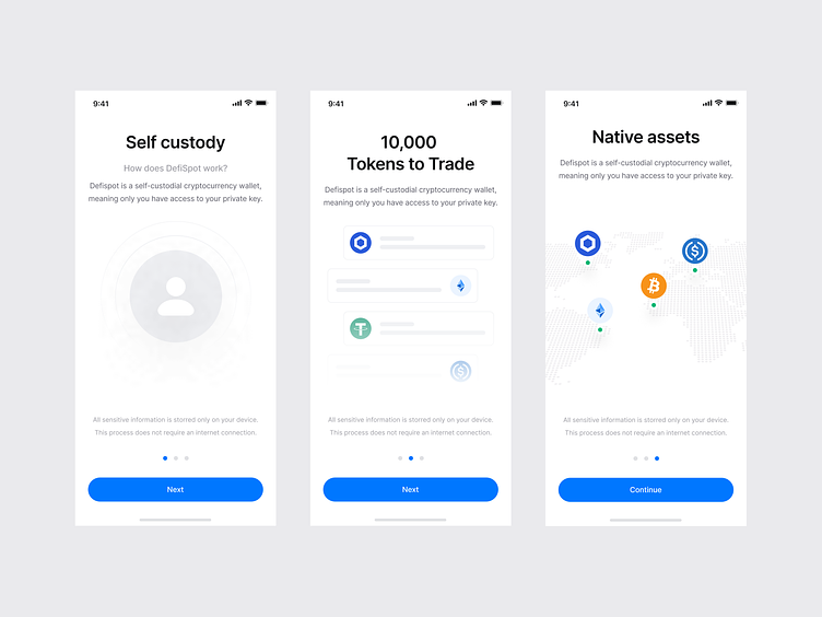
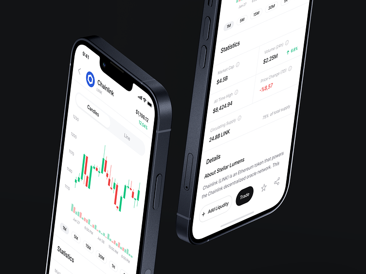
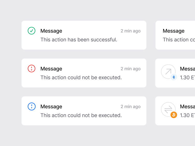
We went for a simple, clean UI that quickly familiarizes the user with the app and its functions. Many processes within web3 apps are still to complex - that’s why we implemented guiding components and overviews that briefly explain every action the user may take, easing their way into the application and guaranteeing a smoother user journey.
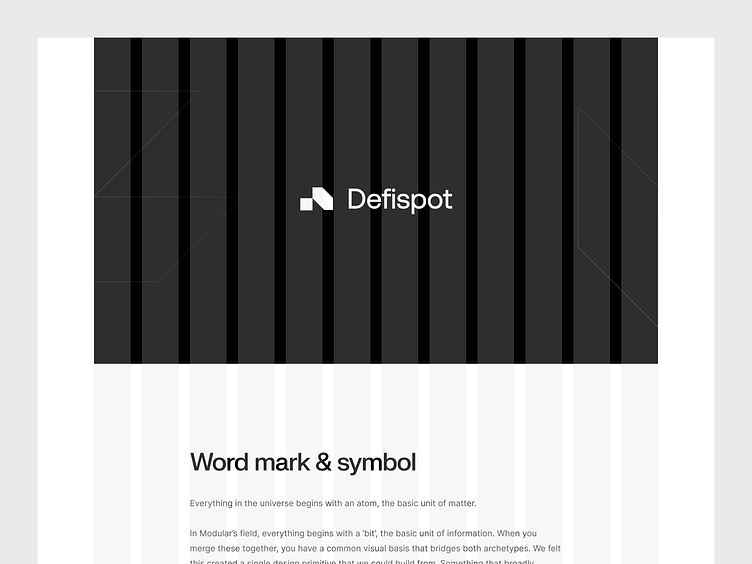
A design system that lasts
The creation of a new design system played a major part in our cooperation with Defispot. Too many companies are stuck with a simple pattern library. We wanted to create a design system that truly acts as a living style guide. So we built a design system that lasts.
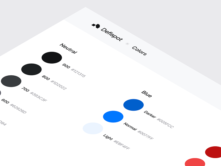
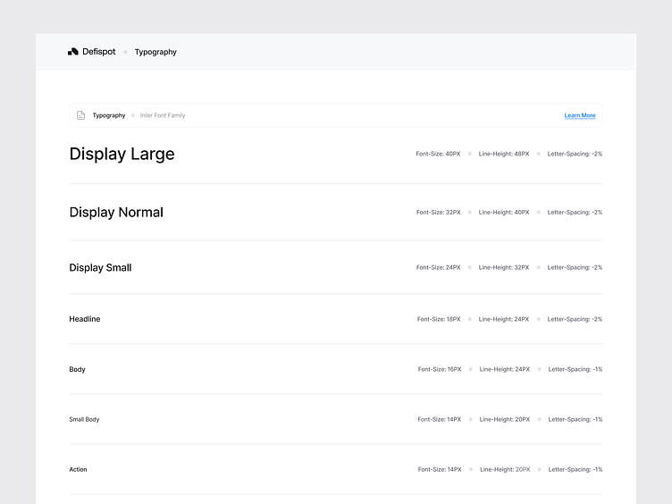
We conducted a thorough visual audit of our client’s current design to determine its qualities, and what to change. Next comes the core of our new design system: the visual language. Through extensive testing and discussing in close collaboration with our client, we defined the new color palette and typography, and determined guidelines for illustrations and icons.
____________________________________________________
🟢 Open for work.
I would love to hear about your idea.
📭 Reach out via mail: hey@kevdu.co
⚡️ Follow on Twitter for more detailed updates.
____________________________________________________