Holistic Cycles logo

Challenge
Holistic Cycles is announcing their entrance into the menstrual & cyclical health space, and differentiating themselves by offering a unique holistic approach. I wanted to create an approachable feel for the brand while maintaining a professional and trustworthy appearance, as their main goal is empowering everyday people through education.
Brief
Wanting to blend both medical / natural and approachable / professional, along with maintaining a feel that was neutral and close to nature. They wanted a logo that had an open and approachable feel that also spoke to the core of what they focused on, holistic cyclical health.
Elements
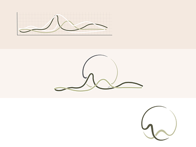
The elements in play for this logo design were the fluctuating hormones (primarily seen on medical charts), the cyclical nature of menstruators, and the two main phases of the menstrual cycle.
This fluctuating hormone pattern is the basis of menstrual health. The cyclic nature of these hormones as well as menstruators themselves is at the core of this space and Holistic Cycles approach to working with people. This was an important element to include into the logo. These hormones & cycles also follow two main phases that go back and forth and including a small nod to this was a nice touch.