Descartes Macropoint - Intro


The client
Descartes is a global leader in uniting businesses in commerce by providing cloud-based logistics and supply chain solutions. Descartes MacroPoint™ is a real-time global freight visibility platform that provides customers with status and location information so they can see all their goods in transit in real-time, at the same time. This data is combined into a single integrated platform that addresses two growing challenges: real-time freight visibility and automated freight matching.
The challenge
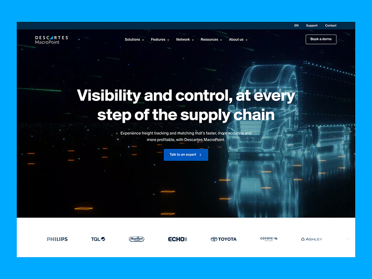
By their own account, the website needed to be updated. It lacked space for the features the company wanted to develop, and it wasn't properly appealing to potential customers. The company wanted a website that targeted the corporate shipper community, better communicated its value proposition, increased conversion rates, and offered a tangible sales opportunity. Descartes wanted to appeal to enterprise prospects and emphasize that Descartes MacroPoint is secure and can combine a complete supply chain picture with a reputable corporate presence.
The solution
We developed a modern and professional brand identity and website that provides a complete picture of the supply chain and offers an experience tailored to all audiences through the use of industry-specific cases. The new visual language and targeted messaging fit within Descartes' framework and provides visitors with a sense of comfort, confidence, and security.
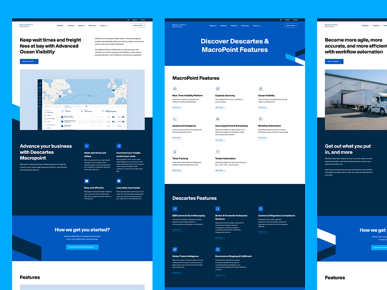
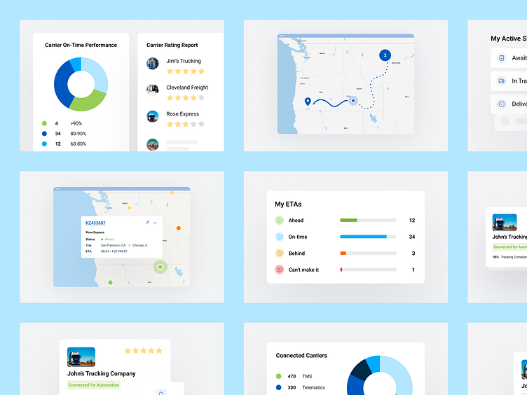
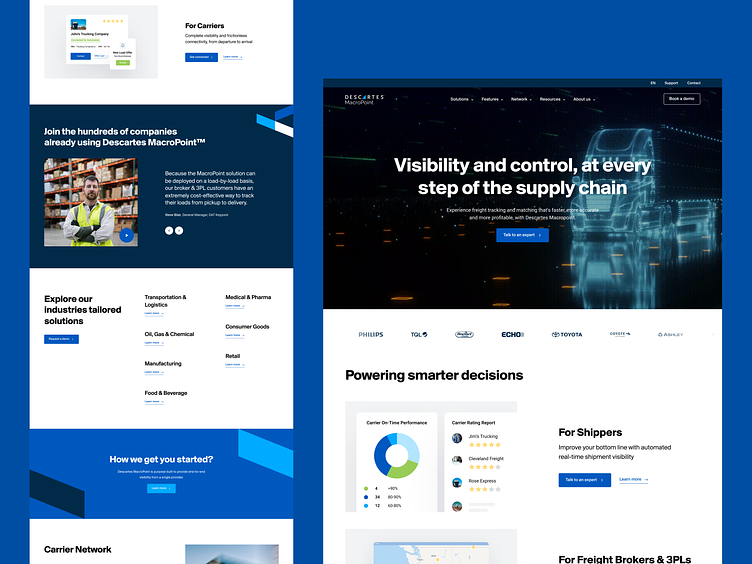
Smart product, clear vision
During the UI process, we wanted to update the brand identity to present a modern, smart product with a clear vision. To appeal to new potential corporate shippers, the more serious, darker blue tones suggested trustworthiness, while lighter shades of blue emphasized the modern side of the brand. In turn, we used shades of green and orange in the product presentation. Creating an entire library of product images helped us showcase the product's capabilities, so customers would know what to expect when they requested a demonstration. The complete list consists of more than 20 product visuals. We also introduced new brand elements in the form of shapes that incorporate elements of direction and freight transportation to create a sense of movement throughout the site. We created a simple guide to ensure consistency of use and to help our development team implement the new shapes. In the UI phase, we developed a systematic, consistent design language to emphasize the seriousness and trustworthiness of the brand. We worked with a clean layout, a geometric sans font typeface inspired by classic fonts but with edgier elements, and added the new brand shapes to make the website more engaging.
Check the live website here.
---
We are BB Agency
We're a digital agency crafting holistic, people-friendly experiences. We serve as a strategic partner for fast-growing tech companies in need of a scalable website with modular CMS, a design system, and a future-proof brand identity. Through challenging core assumptions, we shape the products and services that improve the lives of thousands every single day.
Check us out at www.bb.agency