Just a quick graph

Made a quick graph to represent user behavior. This will be used for a product page and possibly other references to user behavior analytics and eventually make its way into the product UI.
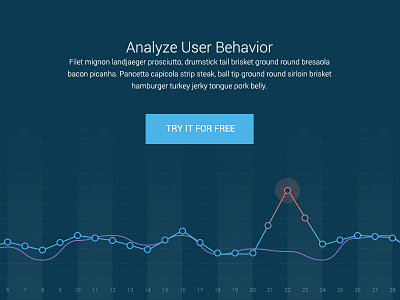
This little guy shows a baseline track (purple) and is compared with the new stats (blue). Day 22 shows a drastic increase, indicating an abnormality with a users activity.
Graphs are fun.