Questions

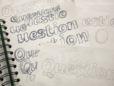
Development sketches for some custom typography as part of a logo I've been working on. I'm going for a bold, chunky italic sans that looks modern and professional, but also quite distinctive and accessible.
I rarely draw italics so it's been a bit of a challenge to get the slant correct and consistent (that 'e-s' needs some serious adjusting) but it's getting there.