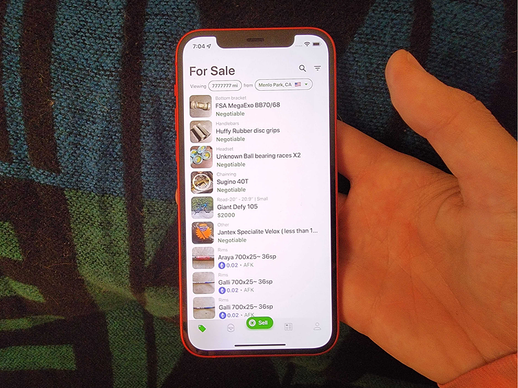
Sprocket iOS Buy/Sell Button Size/UX Feedback


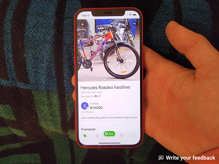
I moved the buy and sell buttons up over the edge of the tab bar to be more visible. What do you think about the size/position of them?
If you like it, don't hesitate to click "L" 💗 or "F".
Sprocket Bicycle App on Android Sprocket Bicycle App on iOS Sprocket Bicycle Blog on Instagram Sprocket Bicycle Blog on Tumblr Sprocket Bicycle Blog on FB