BEA - brand identity & package design for a beauty brand

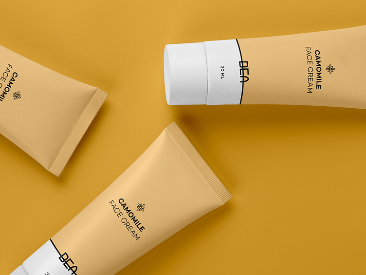
BEA is a minimalist beauty brand with pure ingredients. A brand's name consists of the first 3 letters of the word "beauty".
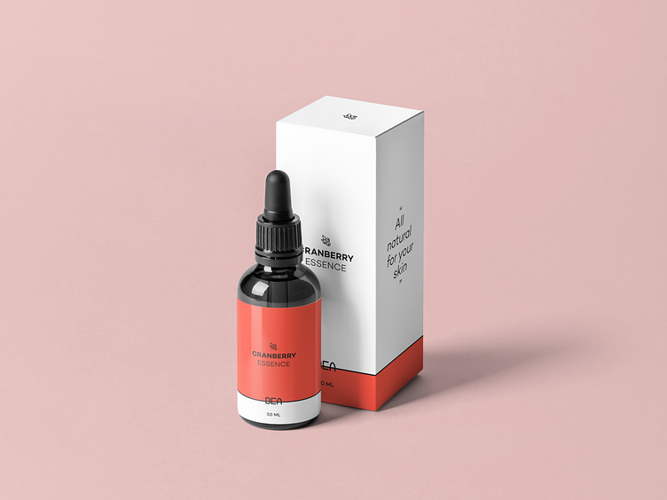
The basic principle is "Cleaner - means better". This applies to skin, ingredients, and of course design. Each element has a meaning and its place.

BEA is a minimalist beauty brand with pure ingredients. The basic principle is "Cleaner - means better". This applies to skin, ingredients, and of course design. Each element has a meaning and its place.

Color palette
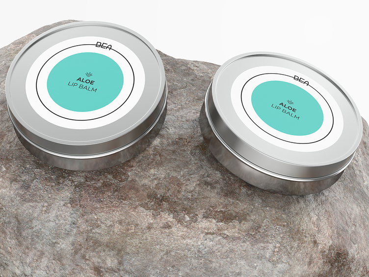
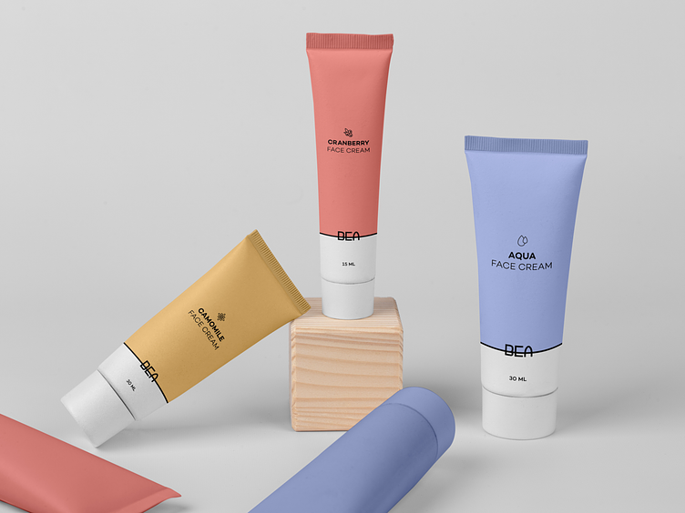
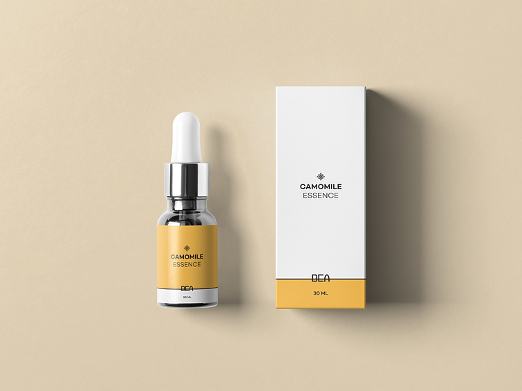
The colors are chosen for each line according to the key components - yellow for chamomile, green for aloe, etc. But the main principle is pure, not too bright, and not too pale colors.
For different products in the line, the color of the packaging may be a paler shade from the main color, this will help to more clearly separate the products.