Tiny Charts – an alternative to Sparklines (3)

Hey everyone! It's been a while but here's the next batch of Tiny Charts. In case you missed the other ones, you can check them out here and here.
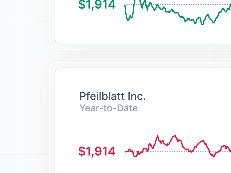
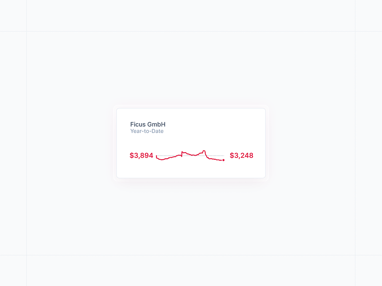
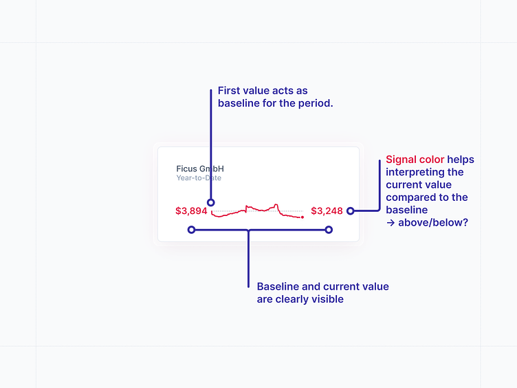
This tiny chart renders data on a much smaller height than the other tiny charts. It uses color to distinguish values over time relative to the start date.
That's it for today ✨
Follow along on Twitter for updates.