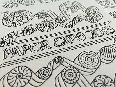
Paper Expo 2015 // Geometry

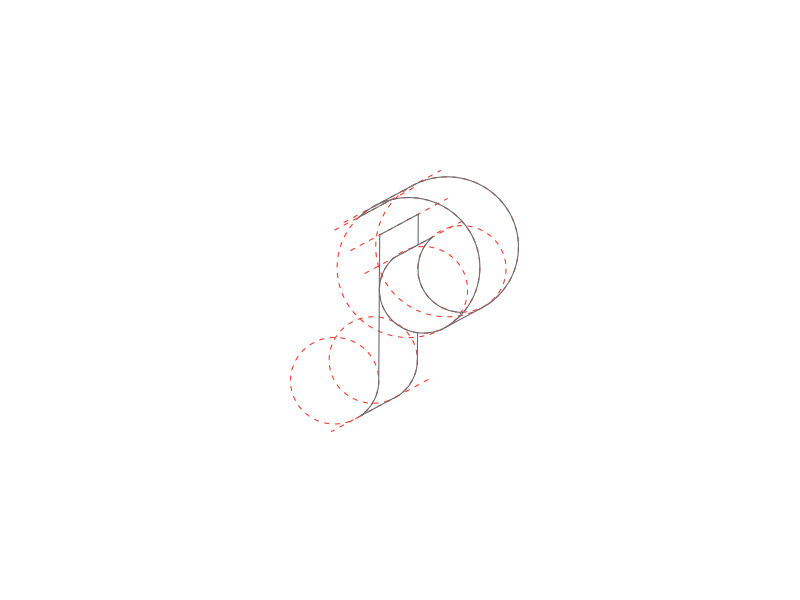
A 'behind the scenes' on how the letterforms for the Paper Expo branding were constructed. The good ol' Golden Ratio was the foundation, and I adhered to it as strictly as possible for the logo, as well as some of the other letters which are currently under construction.