Statemen Pac

“Let us not seek the Republican answer or the Democratic answer, but the right answer. Let us not seek to fix the blame for the past – Let us accept our own responsibility for the future.”
—JFK
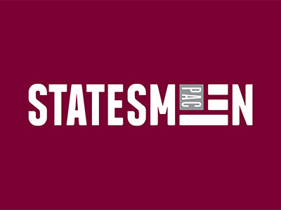
Statesmen Pac is a national, nonpartisan organization that finds and supports local leaders willing to represent their respective communities. In 2013, they asked Eli Kirk to create the logo that would represent the mission of the organization.
I experimented with the idea of representing “the people” as “colonies” of ants and bees because, while tiny, they can achieve great things when they work together—the idea turned out fairly well. I also experimented with a map of the USA I shaped to look like a speech bubble (a little cliché, but hey, sometimes clichés work.)
In the end, we went with a simple, flag shaped icon that served as the letterform “E.” The front is strong and militant, giving the brand a local grassroots feel without coming off as too “occupy wall street.” I particularly liked the shorthand of the logo with only the “S PAC” and flag icon.
We discussed color at length because in politics color communicates a lot of meaning. I addressed this concern by creating a color palette that represented the brand without connecting it to any mainstream parties.