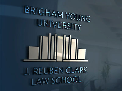
BYU LAW Logo


Seth Taylor and I worked collaboratively on this logo. He acted as creative director while I provided most of the project explorations, and we worked closely together on the final typeface.
At first I experimented with the school building, a beautiful example of seventies architecture. Designed by Fetzer & Fetzer (the same architects who designed the original Provo and Ogden LDS temples), the JRCB was dedicated in the summer of 1975 and stands today as one of the most iconic and historically significant structures in the BYU Provo campus. To me, it looked like a big stack of books, and that was the cool, relevant connection I initially explored.
I drew the building from a number of perspectives until I arrived at a final, simplified version of the symbol. (Rodrigo Suárez, a designer friend from Mexico created a concept that we transformed into the symbol that was finally chosen.)
At the end of the process, after the logo was initially approved, an unknown (to us) executive at the BYU branding office ordered that we use the BYU typeface, specifically the dark blue one that appears in the main university logo. I personally disagreed with the decision; I felt the typeface was too heavy and didn’t have the same neo-art deco feeling as the building itself. The blue was just too dark. We pushed back, but the branding office was committed to their decision.
The final logo feels OK, but it didn’t turn out as balanced as I’d envisioned. It looks like a logo designed by a bureaucratic committee.
And was, in fact, a logo designed by a bureaucratic committee.