Wundercon Light

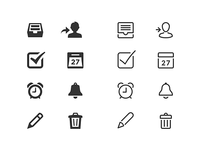
In Wunderlist 2 we introduced our own set of pictograms, which became a core element of the Wunderlist experience. Since then the visual style of the app changed and the pictograms felt more and more outdated.
Which started first in a sideproject by me, became quickly a full project and finally found it’s way into the product. The new pictograms are now matching the character of Wunderlist by being lightweight and friendly, without distracting from the actual content.
Compare the old pictograms with the new ones and tell us what you think!
P.S.: The shown pictograms are just my favourites, the actual set counts more than 100.