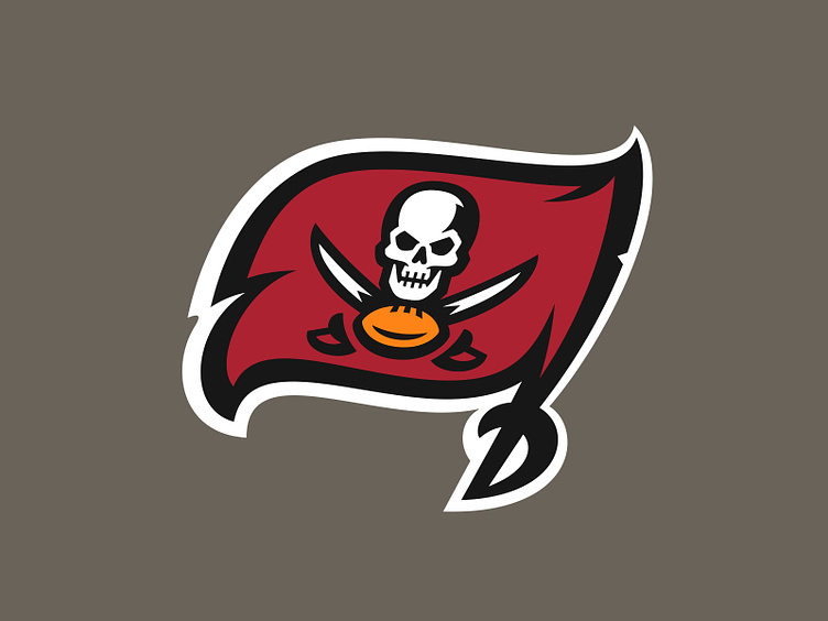
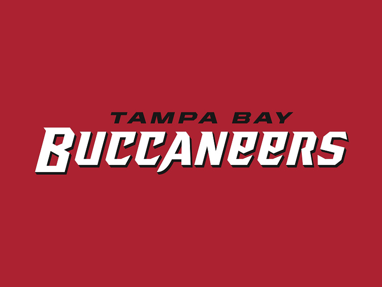
Tampa Bay Buccaneers Concept

An "if it were up to me" spin on the Bucs.
The goal: capture the essence of the “Jolly Roger” flag mark in a way that feels dynamic and proud. Emphasize durability. Acknowledge the historical significance of each era of the brand’s existence.
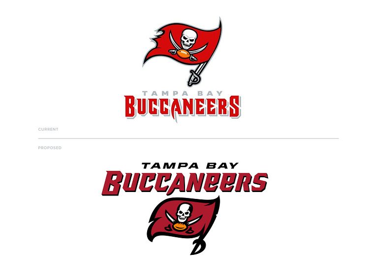
The wordmark maintains some of the visual language of the current, but with a more modern spin. The drop shadow stays but this time it's anchored to the letterforms and a skew is applied to incorporate the same dynamics as the waving flag.
This is only a concept and is no way affiliated with Nike, the Tampa Bay Buccaneers, or the NFL.