Branding & Packaging Design for Caffeinication 🧋


🎨Do the colours make you feel like you are drinking some kind of latte masterpiece🧋?
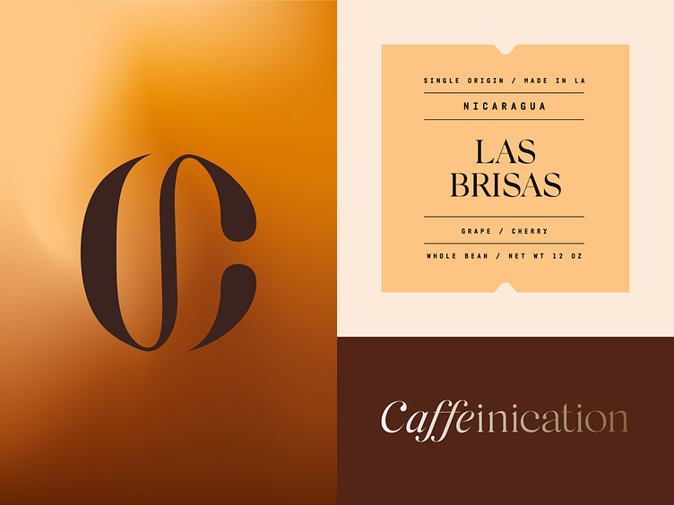
The logo and the colour palette themselves say a lot about the brand and what it's connected to ☕.
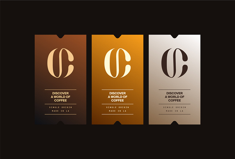
Rich brown shades 🟤 do not get any negative associations if they are combined with prestigious neutral shades. This combination only gives the look of a luxury 👑 and upscale feel to the products.
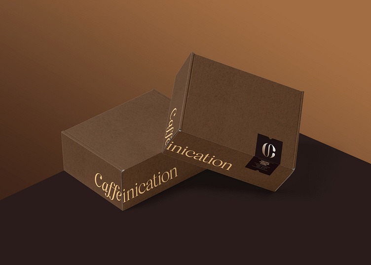
The coffee-like coloured packaging box 🟫 gives a feeling of security, which leads to a thought of the carefully carried product delivery 📮.
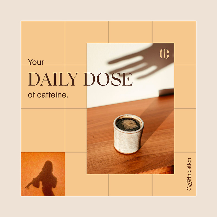
A daily dose of caffeine is one of the longest-acting central nervous system stimulants🧠. At the same time, studies suggest that it can help prolong the development of Alzheimer’s disease and dementia👨🏻🔬.
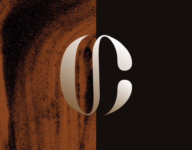
The logo was made by combining a coffee bean and first letter of the brand name.
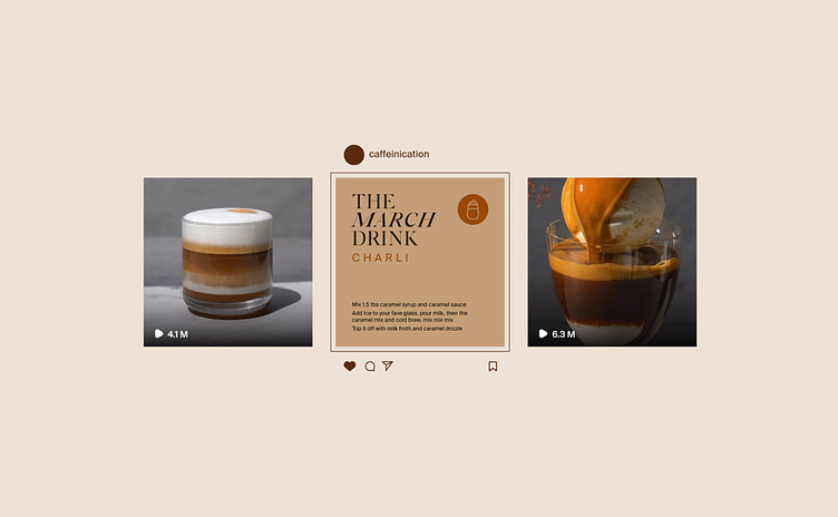
For the media content, we decided to place video recipes of the coffee, and in the middle is the recipe of the coffee of the month🌟.