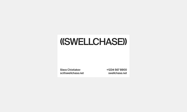
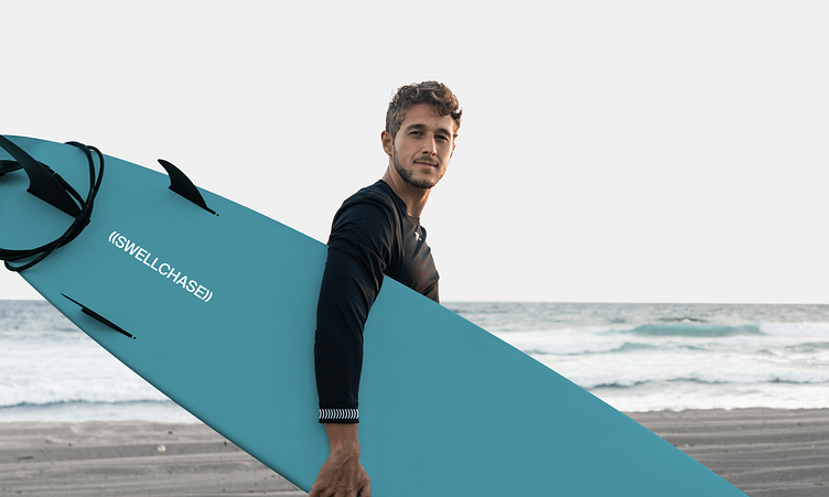
Swell Chase Brand Identity


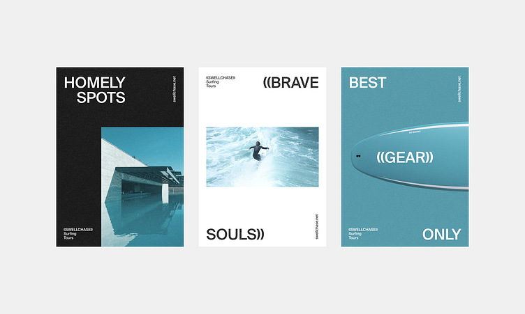
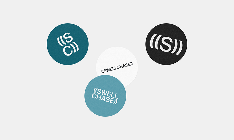
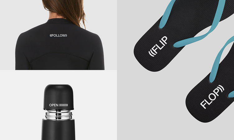
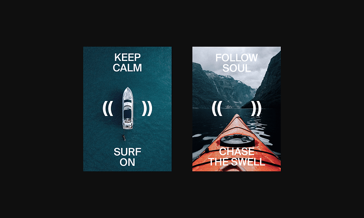
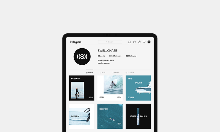
Swellchase is a water sports surf club that organizes surf tours all over the world. We have developed an identity concept for a company, focusing on northern lakes surrounded by mountains, greenery, and coniferous forests. We have developed a discreet corporate identity, somewhat unusual for the surfing direction. Swellchase's identity conveys a restrained, calm, Nordic mood. We used Helvetica-shaped typeface, grotesque, calm, turquoise aqua colors.
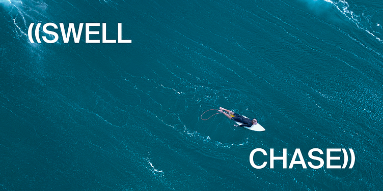
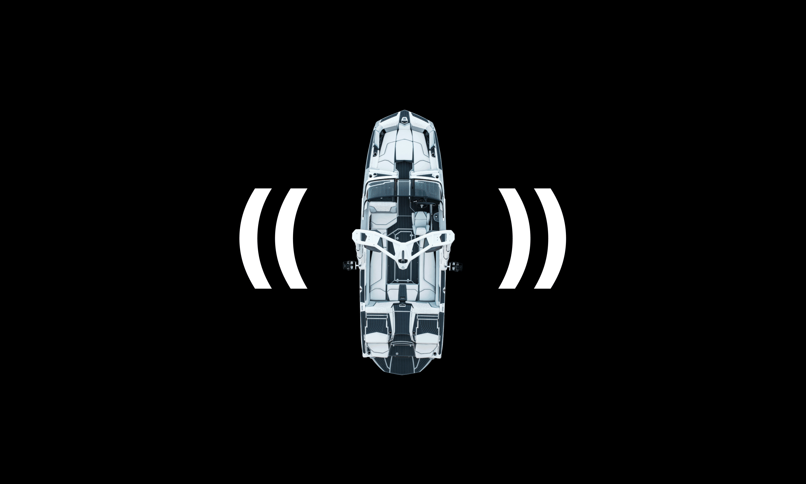
Chasing a wave is the center of the identity concept. Wave-shaped brackets symbolize waves from the boards, boats. The wave is following you, and you are chasing it. The relaxed surfing vibe brings smiles. Brackets provide variability, they can work as frames, you can multiply them, transfer, use them to express emotions. The identity is recognizable, and it works with minimal means. It perfectly illustrates the northern wave vibe & harsh Nordic surfing.


Art Direction: Sergei Anenko
Design: Denis Bezrukov
Made by Evrone.com
Send us an mail@evrone.com
More identity cases: